
Jetpack Compose Material 3 1.5.0-alpha11 introduces expressive list items, a major upgrade to ListItem composables with new APIs for segmented styling and interactive behaviours.
With this alpha release, we gain access to dynamic elevation, shapes, and motion that transform static lists into rich Material You experiences.
Add the dependency
[versions]material3 = "1.5.0-alpha11"
// ....
[libraries]androidx-compose-material3 = { module = "androidx.compose.material3:material3-android", version.ref = "material3" }
// ...
- In the app or module’s build.gradle file:
implementation(libs.androidx.compose.material3)
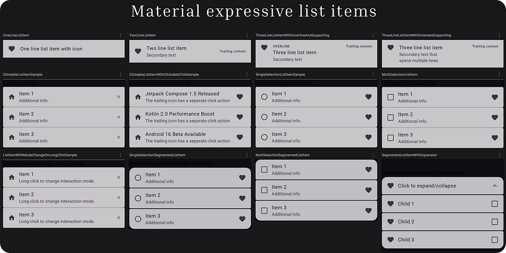
We will cover all the following variants of list items, each with different layouts, interactions, and selection behaviours:
- OneLineListItem,
- TwoLineListItem,
- ThreeLineListItemWithOverlineAndSupporting Content,
- ThreeLineListItemWithExtendedSupporting Content,
- ClickableListItem,
- ClickableListItemWithClickableChild,
- SingleSelectionListItem,
- MultiSelectionListItem,
- SingleSelectionSegmentedListItem,
- MultiSelectionSegmentedListItem, and
- SegmentedListItemWithExpansion.
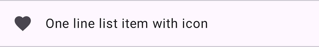
OneLineListItem
@Composable
fun OneLineListItem() {
    Column {
        ListItem(
            headlineContent = { Text("One line list item with icon") },
            leadingContent = {
                Icon(Icons.Filled.Favorite, contentDescription = "")
            },
        )

    }
}
TwoLineListItem
@Composable
fun TwoLineListItem() {
    Column {
        ListItem(
            headlineContent = { Text("Two line list item") },
            supportingContent = { Text("Secondary text") },
            trailingContent = { Text("Trailing content") },
            leadingContent = {
                Icon(Icons.Filled.Favorite, contentDescription = "")
            },
        )
    }
}

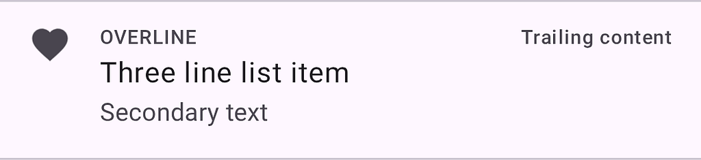
ThreeLineListItemWithOverlineAndSupporting Content
@Composable
fun ThreeLineListItemWithOverlineAndSupporting() {
    Column {
        ListItem(
            headlineContent = { Text("Three line list item") },
            overlineContent = { Text("OVERLINE") },
            supportingContent = { Text("Secondary text") },
            leadingContent = {
                Icon(Icons.Filled.Favorite, contentDescription = "")
            },
            trailingContent = { Text("Trailing content") },
        )
    }
}
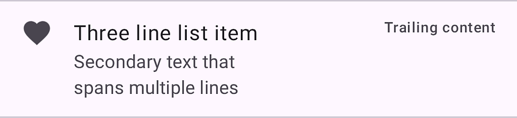
ThreeLineListItemWithExtendedSupporting Content
@Composable
fun ThreeLineListItemWithExtendedSupporting() {
    Column {
        ListItem(
            headlineContent = { Text("Three line list item") },
             // Extended content
            supportingContent = { Text("Secondary text thatnspans multiple lines") },
            leadingContent = {
                Icon(Icons.Filled.Favorite, contentDescription = "")
            },
            trailingContent = { Text("Trailing content") },
        )
    }
}
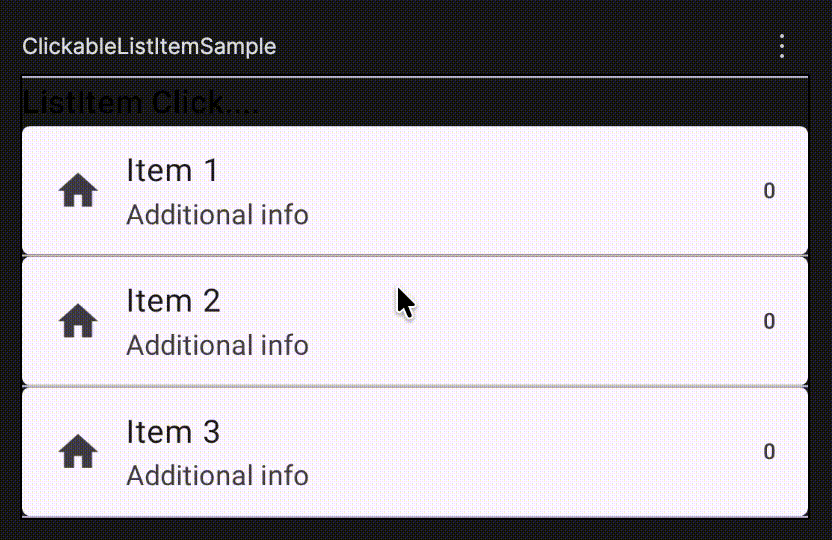
ClickableListItem
@Composable
fun ClickableListItemSample() {
    Column {
        repeat(3) { index ->
            var count by rememberSaveable { mutableIntStateOf(0) }
            ListItem(
                onClick = { count++ },
                leadingContent = { Icon(Icons.Default.Home, contentDescription = null) },
                trailingContent = { Text("$count") },
                supportingContent = { Text("Additional info") },
                content = { Text("Item ${index + 1}") },
            )

        }
    }
}
ClickableListItemWithClickableChild
@Composable
fun ClickableListItemWithClickableChild() {
    Column {
        val context = LocalContext.current
        Text("ListItem Click & Child Click....", style = MaterialTheme.typography.titleMedium)
        newsItems.forEachIndexed { index, item ->
            ListItem(
                onClick = {
                    Toast.makeText(context, "Clicked on the list item", Toast.LENGTH_SHORT).show()
                },
                leadingContent = { Icon(Icons.Default.Home, contentDescription = null) },
                trailingContent = {
                    IconButton(onClick = {
                        Toast.makeText(context, "Clicked on the trailing icon", Toast.LENGTH_SHORT).show()
                    }) {
                        Icon(Icons.Default.Favorite, contentDescription = "Localized description")
                    }
                },
                supportingContent = { Text("The trailing icon has a separate click action") },
                content = { Text(item.headline) },
            )

        }
    }
}

SingleSelectionListItem
@Composable
fun SingleSelectionListItem() {
    Column(Modifier.selectableGroup()) {
        var selectedIndex: Int? by rememberSaveable { mutableStateOf(null) }
        repeat(3) { index ->
            val selected = selectedIndex == index
            ListItem(
                selected = selected,
                onClick = { selectedIndex = if (selected) null else index },
                leadingContent = { RadioButton(selected = selected, onClick = null) },
                trailingContent = { Icon(Icons.Default.Favorite, contentDescription = null) },
                supportingContent = { Text("Additional info") },
                content = { Text("Item ${index + 1}") },
            )

        }
    }
}

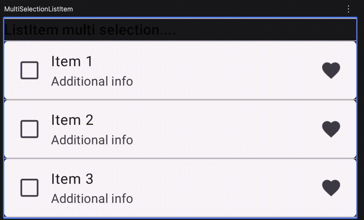
MultiSelectionListItem
@Composable
fun MultiSelectionListItem() {
    Column {
        repeat(3) { index ->
            var checked by rememberSaveable { mutableStateOf(false) }
            ListItem(
                checked = checked,
                onCheckedChange = { checked = it },
                leadingContent = { Checkbox(checked = checked, onCheckedChange = null) },
                trailingContent = { Icon(Icons.Default.Favorite, contentDescription = null) },
                supportingContent = { Text("Additional info") },
                content = { Text("Item ${index + 1}") },
            )
        }
    }
}
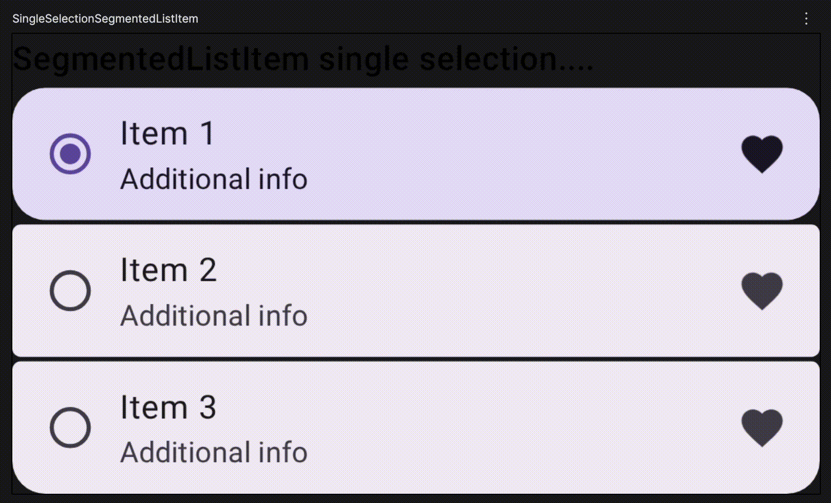
SingleSelectionSegmentedListItem
@Composable
fun SingleSelectionSegmentedListItem() {
    val count = 3
    val colors =
        ListItemDefaults.colors(containerColor = MaterialTheme.colorScheme.surfaceContainer)
    Column(
        modifier = Modifier.selectableGroup(),
        verticalArrangement = Arrangement.spacedBy(ListItemDefaults.SegmentedGap),
    ) {
        var selectedIndex: Int? by rememberSaveable { mutableStateOf(null) }
        repeat(count) { index ->
            val selected = selectedIndex == index
            SegmentedListItem(
                selected = selected,
                onClick = { selectedIndex = if (selected) null else index },
                colors = colors,
                shapes = ListItemDefaults.segmentedShapes(index = index, count = count),
                leadingContent = { RadioButton(selected = selected, onClick = null) },
                trailingContent = { Icon(Icons.Default.Favorite, contentDescription = null) },
                supportingContent = { Text("Additional info") },
                content = { Text("Item ${index + 1}") },
            )
        }
    }
}
MultiSelectionSegmentedListItem
@Composable
fun MultiSelectionSegmentedListItem() {
    val count = 3
    val colors =
        ListItemDefaults.colors(containerColor = MaterialTheme.colorScheme.surfaceContainer)
    Column(verticalArrangement = Arrangement.spacedBy(ListItemDefaults.SegmentedGap)) {
        repeat(count) { index ->
            var checked by rememberSaveable { mutableStateOf(false) }
            SegmentedListItem(
                checked = checked,
                onCheckedChange = { checked = it },
                colors = colors,
                shapes = ListItemDefaults.segmentedShapes(index = index, count = count),
                leadingContent = { Checkbox(checked = checked, onCheckedChange = null) },
                trailingContent = { Icon(Icons.Default.Favorite, contentDescription = null) },
                supportingContent = { Text("Additional info") },
                content = { Text("Item ${index + 1}") },
            )
        }
    }
}

SegmentedListItemWithExpansion
@Composable
fun SegmentedListItemWithExpansion() {
    var expanded by rememberSaveable { mutableStateOf(false) }
    val numChildren = 3
    val itemCount = 1 + if (expanded) numChildren else 0
    val childrenChecked = rememberSaveable { mutableStateListOf(*Array(numChildren) { false }) }

    val colors =
        ListItemDefaults.colors(containerColor = MaterialTheme.colorScheme.surfaceContainer)

    Column(
        verticalArrangement = Arrangement.spacedBy(ListItemDefaults.SegmentedGap),
    ) {
        SegmentedListItem(
            onClick = { expanded = !expanded },
            modifier =
                Modifier.semantics { stateDescription = if (expanded) "Expanded" else "Collapsed" },
            colors = colors,
            shapes = ListItemDefaults.segmentedShapes(index = 0, count = itemCount),
            leadingContent = { Icon(Icons.Default.Favorite, contentDescription = null) },
            trailingContent = {
                Icon(
                    if (expanded) Icons.Default.ExpandLess else Icons.Default.ExpandMore,
                    contentDescription = null,
                )
            },
            content = { Text("Click to expand/collapse") },
        )
        AnimatedVisibility(
            visible = expanded,
            enter = expandVertically(MaterialTheme.motionScheme.fastSpatialSpec()),
            exit = shrinkVertically(MaterialTheme.motionScheme.fastSpatialSpec()),
        ) {
            Column(verticalArrangement = Arrangement.spacedBy(ListItemDefaults.SegmentedGap)) {
                repeat(numChildren) { index ->
                    SegmentedListItem(
                        checked = childrenChecked[index],
                        onCheckedChange = { childrenChecked[index] = it },
                        colors = colors,
                        shapes =
                            ListItemDefaults.segmentedShapes(index = index + 1, count = itemCount),
                        leadingContent = {
                            Icon(Icons.Default.Favorite, contentDescription = null)
                        },
                        trailingContent = {
                            Checkbox(checked = childrenChecked[index], onCheckedChange = null)
                        },
                        content = { Text("Child ${index + 1}") },
                    )
                }
            }
        }
    }
}

References
Compose Material 3 | Jetpack | Android Developers
Keep in touch
https://www.linkedin.com/in/navczydev/
- JavaScript is not available.
- navczydev.bsky.social
- navczydev – Overview
- Nav Singh (@navczydev@androiddev.social)
Beyond Flat Lists: Build Expressive Material 3 Lists in Compose was originally published in ProAndroidDev on Medium, where people are continuing the conversation by highlighting and responding to this story.


This Post Has 0 Comments