
Master dynamic height Top App Bars in Jetpack Compose. Build flexible, reactive headers that go beyond the limitations of standard Material 3 components.

Have you ever wanted to create a detailed header that gracefully collapses into a simple title bar?
We often encounter designs where a top app bar needs to react fluidly to the content scrolling beneath it. While Material Design 3 provides great defaults, sometimes we need more control.
In this article, we’ll build a Dynamic Height Top App Bar in Jetpack Compose that gives you complete freedom over how your app bar transforms during scroll.
The Problem with Standard App Bars
Material3’s TopAppBar, MediumTopAppBar, and LargeTopAppBar are fantastic for standard use cases. They handle the “big to small” text transition beautifully.
However, they have limitations:
— Restricted Layouts: You are mostly limited to a title, navigationIcon, and actions.
— Predefined Transformations: You can’t easily animate arbitrary elements (like an avatar resizing or buttons fading out) based on the scroll position.
— Two-Slot System: Material’s TwoRowsTopAppBar (used for Medium and Large) essentially switches between a “collapsed” and “expanded” title slot. It doesn’t give you a continuous scroll progress value to drive custom animations.
If you look at the source code for TwoRowsTopAppBar in AppBar.kt, you’ll see it calculates a collapsedFraction but mostly keeps its internal logic private or internal, making it hard to extend for custom behaviors.
Our Solution: A Content-Aware Dynamic Bar
We want a Top App Bar that:
- Accepts a minHeight and maxHeight.
- Connects to a TopAppBarScrollBehavior to react to scroll events.
- Crucially, exposes the current offset or progress to its content, allowing us to animate anything we want.
Let’s build DynamicHeightTopAppBar.
Step 1: Defining the API
We’ll start by defining our Composable. It needs to know the height limits and the scroll behavior. The content lambda will receive the current offsetDp (how much we’ve scrolled) and statusBarHeight (so we can draw behind the status bar if needed).
@OptIn(ExperimentalMaterial3Api::class)
@Composable
fun DynamicHeightTopAppBar(
    modifier: Modifier = Modifier,
    minHeight: Dp,
    maxHeight: Dp,
    scrollBehavior: TopAppBarScrollBehavior?,
    content: @Composable (offsetDp: Dp, statusBarHeight: Dp) -> Unit
) {
    // ... implementation
}
Step 2: Handling Height and Scroll Logic
We can reuse some logic from Material’s implementation. Specifically, TopAppBarScrollBehavior maintains a TopAppBarState which tracks the heightOffset.
We need to tell the state how much it can scroll. The heightOffsetLimit should be the difference between our min and max height.
    val density = LocalDensity.current
    val maxHeightPx: Float
    val minHeightPx: Float

    with(density) {
        maxHeightPx = maxHeight.toPx()
        minHeightPx = minHeight.toPx()
    }

    // Set the app bar's height offset limit to collapse from maxHeight to minHeight
    SideEffect {
        if (scrollBehavior?.state?.heightOffsetLimit != minHeightPx - maxHeightPx) {
            scrollBehavior?.state?.heightOffsetLimit = minHeightPx - maxHeightPx
        }
    }
Step 3: Reusing Material’s Fling Logic
One of the trickiest parts of a custom app bar is handling the “fling” or “snap” behavior. If a user drags the bar halfway and lets go, it should either snap open or closed, or continue its momentum.
The Material library has a settleAppBar function that handles this perfectly. Since it’s often private or internal in the library, we’ve brought a copy of it into our file to ensure our custom bar feels just like a native one.
Note: The settleAppBar function uses DecayAnimationSpec and AnimationState to calculate where the bar should land based on velocity.
We attach this logic using a draggable modifier:
    // Set up support for resizing the top app bar when vertically dragging the bar itself
    val appBarDragModifier =
        if (scrollBehavior != null && !scrollBehavior.isPinned) {
            Modifier.draggable(
                orientation = Orientation.Vertical,
                state = rememberDraggableState { delta ->
                    scrollBehavior.state.heightOffset += delta
                },
                onDragStopped = { velocity ->
                    settleAppBar(
                        scrollBehavior.state,
                        velocity,
                        scrollBehavior.flingAnimationSpec,
                        scrollBehavior.snapAnimationSpec
                    )
                }
            )
        } else {
            Modifier
        }
Step 4: The Content Layout
Now for the fun part. We calculate the currentHeight and the offsetDp to pass to our content.
We also handle WindowInsets to ensure we can draw edge-to-edge (behind the status bar) while giving the content the information it needs to avoid overlapping system icons.
    // Calculate current offset in Dp to pass to content
    val currentHeightOffset = scrollBehavior?.state?.heightOffset ?: 0f
    val offsetDp = with(density) { currentHeightOffset.absoluteValue.toDp() }

    // Get status bar height
    val statusBarHeight = with(density) {
        WindowInsets.statusBars.getTop(density).toDp()
    }

    // Calculate total height
    val currentHeight = maxHeight + statusBarHeight + with(density) { currentHeightOffset.toDp() }

    Surface(modifier = modifier.then(appBarDragModifier), color = Color.Transparent) {
        Box(
            modifier = Modifier
                .clipToBounds()
                .height(currentHeight)
        ) {
            content(offsetDp, statusBarHeight)
        }
    }
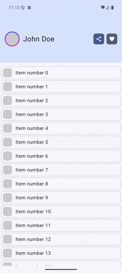
Usage Example: The Shrinking Profile Header
Now let’s use our DynamicHeightTopAppBar to build a complex profile header.
We want:
— An avatar that shrinks from 50dp to 20dp.
— A username that scales from 24sp to 14sp.
— Action buttons that fade out as we collapse.
Here is how we implement it :
@Composable
fun MyTopAppBar(modifier: Modifier = Modifier, scrollBehavior: TopAppBarScrollBehavior) {
    DynamicHeightTopAppBar(
        scrollBehavior = scrollBehavior,
        modifier = modifier.fillMaxWidth(),
        minHeight = 56.dp,
        maxHeight = 160.dp
    ) { offsetDp, statusBarHeight ->

        // 1. Calculate Progress (0.0 -> Collapsed, 1.0 -> Expanded)
        val maxOffset = 104.dp // (maxHeight - minHeight)
        val progress = 1f - (offsetDp.value / maxOffset.value).coerceIn(0f, 1f)

        Box(
            modifier = Modifier
                .fillMaxSize()
                .background(MaterialTheme.colorScheme.primaryContainer)
        ) {
            Row(
                modifier = Modifier
                    .fillMaxSize()
                    .padding(top = statusBarHeight) // Respect status bar
                    .padding(horizontal = 16.dp),
                verticalAlignment = Alignment.CenterVertically,
                horizontalArrangement = Arrangement.spacedBy(12.dp)
            ) {
                // 2. Dynamic Avatar Size
                val avatarSize = (20.dp.value + (50.dp.value - 20.dp.value) * progress).dp

                UserAvatar(
                    borderSize = (1f + progress).dp,
                    backgroundColor = Color.LightGray,
                    avatarSize = avatarSize
                )

                // 3. Dynamic Font Size
                val fontSize = (14f + (24f - 14f) * progress).sp

                Text(
                    text = "John Doe",
                    fontSize = fontSize,
                    modifier = Modifier.weight(1f)
                )

                // 4. Fade out actions
                // Fade out quickly: 0dp to 30dp scroll
                val actionAlpha = (1f - (offsetDp.value / 30f)).coerceIn(0f, 1f)

                Row(
                    modifier = Modifier.alpha(actionAlpha),
                    horizontalArrangement = Arrangement.spacedBy(8.dp)
                ) {
                    // Action Icons...
                }
            }
        }
    }
}
Key Differences from Material

Conclusion
By stripping away the slot-based restrictions of the standard Material Top App Bar and exposing the raw scroll offset, we unlock a world of creative possibilities. We can reuse the robust scroll physics (via TopAppBarScrollBehavior and settleAppBar) while maintaining complete control over the visual presentation.
This approach is perfect for profile screens, detailed product headers, or any screen where you want to provide a rich, immersive experience that gets out of the way as the user consumes content.
Happy coding!
Dynamic Height Top App Bar in Jetpack Compose was originally published in ProAndroidDev on Medium, where people are continuing the conversation by highlighting and responding to this story.
This Post Has 0 Comments