
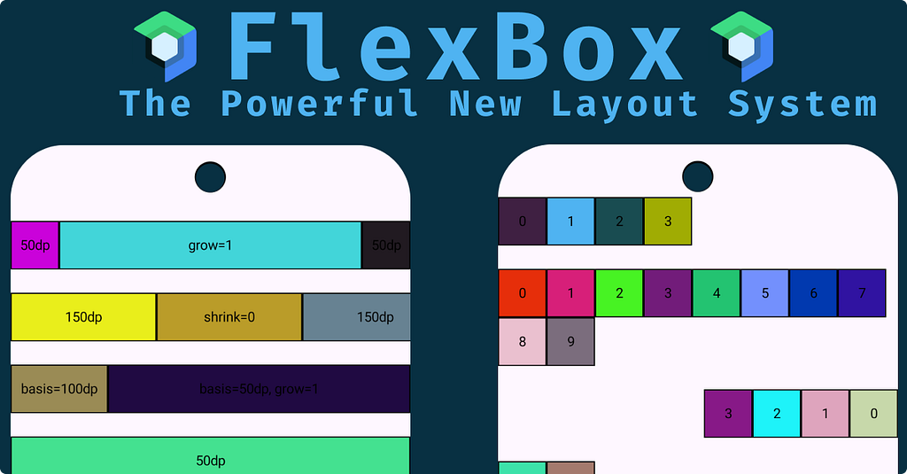
Jetpack Compose continues to evolve, and with the introduction of the new FlexBox layout, we finally have a powerful, flexible way to design adaptive UIs — inspired by the CSS Flexbox model.

- If you’ve ever used Row, Column, or FlowRowYou’ll feel right at home. FlexBox acts as a superset, combining their capabilities while providing granular control over alignment, wrapping, and item distribution.
- Until now, we had to choose between rigid layouts (Row/Column) or more dynamic ones (FlowRow/FlowColumn).
- FlexBox merges the best of both worlds — flexibility and simplicity.
What Is FlexBox?
- Composable brings the concept of flexible layouts from the web into Jetpack Compose.
- Arranges its children dynamically, allowing them to grow, shrink, or wrap based on available space and configuration.

FlexBox API
🏗️ Building blocks and their roles.
FlexBox
The main composable responsible for arranging children.
FlexBox(
    config = {
        direction(FlexDirection.Row)
        wrap(FlexWrap.Wrap)
        justifyContent(FlexJustifyContent.SpaceBetween)
        alignItems(FlexAlignItems.Center)
        gap(8.dp)
    },
    modifier = Modifier
        .border(1.dp, Color.Black)
) {
    Text(
        "Item 1",
        Modifier
            .flex {
                grow(1f)
            }
            .background(color = randomColor())
            .border(1.dp, Color.Black)
    )
    Text(
        "Item 2",
        Modifier
            .flex {
                basis(80.dp)
            }
            .background(color = randomColor()))
}

FlexBoxConfig
Configures the container’s layout behavior — direction, wrapping, justification, alignment, and spacing.
Key parameters:
- direction: Controls the main axis (Row, Column).
- wrap: Determines if items flow onto new lines.
Here we have 3 options: Wrap, NoWrap, WrapReverse - justifyContent: Distributes space along the main axis(start, end, etc).
- alignItems: Defines how items align on the cross-axis(start, end, etc).
- alignContent: Controls how multiple lines are distributed along the cross-axis.
This applies only when the wrap is FlexWrap.Wrap or FlexWrap.WrapReverse and there are multiple lines of items.
- gap: Adds spacing between items (horizontal and vertical).
Modifier.flex
- Used to fine-tune each child’s flexibility and order within the layout.
Supported parameters:
- grow: Defines how much an item can expand relative to others.
- shrink: Dictates how an item shrinks to avoid overflow.
- basis: Sets the item’s initial size before it grows or shrinks.
- order : Determines the display order within the FlexBox.
- alignSelf: Overrides container alignment for a specific child.
Code Samples
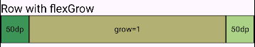
- FlexBox + Row + Flex + Grow + Basis
@Composable
fun FlexBoxRowFlexGrow() {
    FlexBox(
        modifier = Modifier
            .fillMaxWidth()
            .border(1.dp, Color.Black)
    ) {
        Box(
            modifier =
                Modifier
                    .width(50.dp)
                    .height(50.dp)
        ) {
            Text(text = "50dp")
        }
        Box(
            modifier =
                Modifier
                    .width(50.dp)
                    .height(50.dp)
                    .flex {
                        grow(1f)
                        basis(50.dp)
                    }
        ) {
            Text(text = "grow=1")
        }
        Box {
            Text(text = "50dp")
        }
    }
}
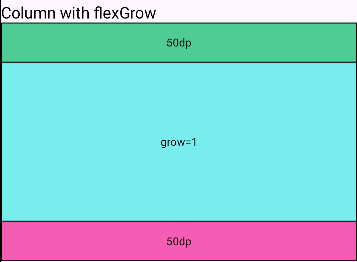
- FlexBox + Column + FlexGrow
@Composable
private fun FlexBoxColumnFlexGrowSample() {
    FlexBox(
        config = { direction(FlexDirection.Column) },
        modifier = Modifier
            .height(300.dp)
            .border(1.dp, Color.Black),
    ) {
        Box {
            Text(text = "50dp")
        }
        Box(
            modifier =
                Modifier
                    .height(50.dp)
                    .flex { grow(1f) }
        ) {
            Text(text = "grow=1")
        }
        Box {
            Text(text = "50dp")
        }
    }
}
- FlexBox + RowWrap
@Composable
private fun FlexBoxRowWrapDemo() {
    FlexBox(
        config = {
            direction(FlexDirection.Row)
            wrap(FlexWrap.Wrap)
        }
    ) {
        repeat(10) {
            Box(
                modifier = Modifier
                        .size(50.dp)
            ) {
                Text(text = "$it")
            }
        }
    }
}

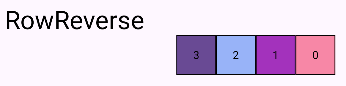
- FlexBox + RowReverse
@Composable
private fun FlexBoxRowReverse() {
    FlexBox(
        config = { direction(FlexDirection.RowReverse) },
        modifier = Modifier.fillMaxWidth()
    ) {
        repeat(4) {
            Box(
                modifier = Modifier.size(50.dp)
            ) {
                Text(text = "$it")
            }
        }
    }
}
References
Stay in touch
https://www.linkedin.com/in/navczydev/
Meet FlexBox: The Powerful New Layout System for Compose was originally published in ProAndroidDev on Medium, where people are continuing the conversation by highlighting and responding to this story.


This Post Has 0 Comments