
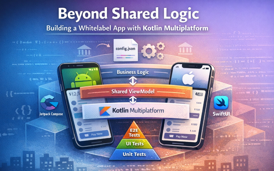
Beyond Shared Logic: How to Build a Whitelabel app with Kotlin Multiplatform.
How we achieved 70% code sharing and a 100% native UI feel in a production-grade banking super-app.
In this article, we cover:
- The Dilemma: Balancing code sharing vs. native user experience.
- The Solution: Using KMP to share UI intent while keeping rendering native.
- The Code: How we used Config state objects to decouple logic from views in Compose and SwiftUI.
- The Pipeline: How JSON configuration drives branding for multiple clients.
- The Deep Dive: A look at the “Feature Anatomy” and shared ViewModels that made 70% code sharing possible.
In the world of cross-platform development, there is often a tug-of-war between code sharing and user experience. If you share too much (e.g., rigid hybrid frameworks), the UI feels “off.” If you share too little, you drown in duplicate maintenance.
Recently, my team tackled a massive challenge: building a white-label banking solution that needed to support multiple client brands, feature sets, and strict regulatory requirements.
Our solution? Kotlin Multiplatform (KMP) paired with Atomic Design System.
This architecture allowed us to share ~70% of our code — including UI state and styling logic — while rendering pixel-perfect native UIs with Jetpack Compose (Android) and SwiftUI (iOS). Here is how we did it.
The Challenge: White-Labeling at Scale
We weren’t just building one app; we were building an engine to generate dozens of apps. Each client needed:
- Unique branding (Colors, Typography, Icons).
- Specific feature sets (e.g., some want Crypto, others just Cards).
- Native performance (Banking users have zero tolerance for lag).
Maintaining two separate codebases (Kotlin/Swift) would have doubled our engineering cost and slowed down updates. We needed a single source of truth.
The Architecture: Config-Driven Design
Standard KMP is great for sharing business logic (Domains, Platform Modules, Local/Remote Data Sources). But we wanted to push it further.
We asked: Can we share the UI definition without sacrificing the native rendering?
We adopted an Atomic Design approach where every component is defined by a shared Config object.
The Pattern
Instead of writing UI logic in the view, we moved it to the shared KMP layer.
1. The Config (Shared CommonMain) The Config is a data class that holds the content and intent of a component. It is the single source of truth.
Kotlin
// platform/kdesign/src/commonMain/kotlin/.../atom/button/KButton.kt
object KButton {
    @Immutable
    data class Config(
        val text: KStringDesc? = null,
        val action: (() -> Unit)? = null,
        val variant: Variant = Variant.Primary,
        val state: State = State.Default,
    ) {
        // Derives the visual style from the config
        fun style(): Style = Style(variant, state)
    }
// The Style determines how it looks (colors, padding, etc.)
    @Immutable
    data class Style(val variant: Variant, val state: State) {
        val backgroundColor: KColorResource
            get() = when (variant) {
                Variant.Primary -> KThemeSpec.colors.buttonPrimaryBg
                Variant.Secondary -> KThemeSpec.colors.buttonSecondaryBg
            }
    }
}
2. The Native Rendering (Android & iOS) The platforms are “dumb.” They don’t make logic decisions. They simply take a Config and render it using their native frameworks.
Android (Jetpack Compose):
Kotlin
@Composable
fun PButton(config: KButton.Config) {
    val style = config.style()

    Button(
        onClick = { config.action?.invoke() },
        colors = ButtonDefaults.buttonColors(
            containerColor = style.backgroundColor.toColor()
        )
    ) {
        // Render content
    }
}
iOS (SwiftUI):
Swift
struct PButtonView: View {
    let config: KButton.Config
    private let style: KButton.Style

    init(config: KButton.Config) {
        self.config = config
        self.style = config.style()
    }

    var body: some View {
        Button(action: { config.action?() }) {
            // Render content
        }
        .background(Color(style.backgroundColor.name))
    }
}
This ensures that logic mismatches are impossible. If a button is supposed to be disabled when a form is invalid, that logic lives in the shared ViewModel/Config. Both platforms update identically.
Powering White-Labeling with JSON
To support multiple clients, we used a robust resource generation pipeline.
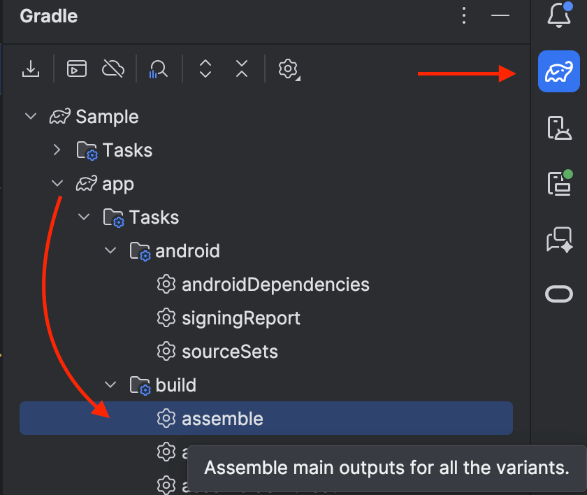
Each client has a config.json file. During the build process (using Gradle tasks), we parse these files to generate the necessary resources.
- Feature Flags: Dynamic loading of Gradle modules based on enabled features (e.g., includeBuild(“features/crypto”)).
- Theming: Colors and fonts are generated into Android XML/Compose objects and iOS .xcassets automatically.
This reduced client onboarding time from 2 weeks to ~2 days.
The Tech Stack & Tooling
To make this architecture robust, we leaned on a modern stack:
- Gradle Composite Builds: We modularized the app into 16+ features (Auth, Wallet, Transactions), allowing for fast incremental builds and clear separation of concerns.
- SKIE: A game-changer for KMP. It improves Swift interoperability, turning Kotlin sealed classes into Swift enums and making Coroutines Flow easier to consume in SwiftUI.
- XcodeGen: We don’t commit .xcodeproj files. The iOS project is generated on the fly, ensuring that file references never get out of sync with the Gradle configuration.
The Results
By moving the “Brain” of the UI into KMP and leaving only the “Skin” to the platforms, we achieved significant metrics:
- ~70% Code Sharing: Business logic, networking, and design system definitions are written once.
- 40% Faster Feature Dev: Developers focus on one implementation of the logic. The UI implementation is just mapping properties.
- Consistency: The design system is enforced by the type system. You physically cannot create a button that doesn’t adhere to the brand guidelines.
Feature Anatomy: Scaling One Feature Across Platforms
To understand how we achieved ~70% code sharing without compromising native UI quality, it helps to look at how a single feature is structured.
We don’t treat a feature as “just a screen.”
Each feature is a self-contained vertical slice with clear ownership, enforced by tooling and scaffolding.
The Anatomy of a Feature

What Makes This Powerful
1. Business Logic Stays Pure
The Domain layer contains only:
- Models
- Interfaces
- Use cases
No platform code. No UI assumptions.
This logic is written once and shared everywhere.
2. Data Is Swappable
The Data layer implements domain contracts:
- APIs
- Caching
- Persistence
- Mapping
You can change how data is fetched without touching UI or business rules.
3. The UI “Brain” Is Shared
The Presentation layer is where the real leverage happens:
- A shared ViewModel
- Event-driven state machine
- Immutable UI configs
This layer decides what the UI should look like and how it should behave — once.
4. Platforms Are Thin and Native
Android and iOS don’t contain logic.
They simply:
- Render a shared Config
- Invoke callbacks
Jetpack Compose and SwiftUI remain fully native, but logic mismatches become impossible.
The Key Insight
We don’t share UI code.
We share UI intent.
By sharing:
- State
- Events
- Styling rules
- Component structure
…and letting each platform render natively, we get:
- Pixel-perfect native UI
- Consistent behavior across platforms
- Massive reduction in duplicate work
This disciplined feature structure is what allows us to scale white-label banking apps confidently — without sacrificing performance, quality, or developer sanity.
How the Shared ViewModel Drives UI State
One of the core innovations in this architecture is how UI behavior and business logic live in a shared ViewModel, powered by a state machine and driven entirely by UI intent (events and configs). This ensures:
- A single source of truth for screen behavior
- Predictable state transitions across platforms
- Maximum testability
Here’s how it works in practice using your Sample feature:
https://medium.com/media/5ee02faa371bd37f75beef0968c2d75c/href
What’s Happening Here
✅ Shared UI Contract
- The ViewModel works with a screen contract: a Config describing UI state, and Event objects representing user actions.
- The StateMachine interface consumes events and exposes a StateFlow of Config.
✅ Event-Driven Updates
- Each user action (OnInputChanged, OnSubmitClicked) maps to:
- A state update (immutable config)
- Possible business logic execution (like calling a use case)
This makes the ViewModel:
- Deterministic — every state is a pure function of previous state + event
- Testable — you can drive it entirely with events in unit tests
- Platform-agnostic — UI rendering is just a projection of the current config
✅ Shared Logic, Native Rendering
Platforms (Compose / SwiftUI) simply observe the state flow and render the config:
- No logic on the UI layer
- No duplicate event handling
- No drift between Android/iOS behavior
This pattern is the backbone of how we keep one implementation of behavior yet ship native UI every time.
Testing at Scale: Unit, UI, and E2E Automation
Architecture alone isn’t enough — it has to be provably correct at scale.
From day one, testing was treated as a first-class architectural concern, not an afterthought.
Because our features follow a strict, shared structure, testing becomes predictable and repeatable.
1. Shared Unit Tests (The Safety Net)
Most of the logic lives in the shared KMP layer, so that’s where we focus first.
For every feature, we write shared ViewModel tests that:
- Validate the initial UI state
- Verify event → state transitions
- Assert business rules and edge cases
- Run once, covering both platforms
Because the ViewModel emits immutable UI configs, tests are simple:
“Given this event, does the UI config change as expected?”
This gives us fast feedback and catches regressions before they ever reach a device.
2. Native UI Tests (Platform Confidence)
While logic is shared, rendering is native — so we still test it natively.
On Android, we use:
- Compose UI tests
- Robot-style abstractions for readability
These tests verify:
- Screens render correctly
- User interactions are wired properly
- Accessibility identifiers are stable
The UI layer stays thin, so these tests are stable and rarely break.
3. End-to-End Tests (Real User Flows)
Finally, we validate what truly matters: real user journeys.
Our E2E tests:
- Launch the app as a user would
- Navigate across multiple screens
- Validate success and failure paths
Because features are modular and config-driven, E2E tests compose cleanly across clients and feature sets.
Why This Works
This layered testing strategy works because it mirrors the architecture:
- Shared logic → shared tests
- Native UI → native UI tests
- Critical flows → E2E automation
As a result:
- Bugs are caught early
- Platform drift is minimized
- New white-label clients don’t explode the test matrix
In a banking app — where correctness, consistency, and trust are non-negotiable — this testing strategy is what allows us to move fast without breaking things.

Conclusion
Kotlin Multiplatform is often pitched as a way to share data layers. However, the Whitelabel Banking App proves that KMP can handle much more.
By implementing a Config-Driven Design System, we bridged the gap between native performance and cross-platform efficiency. We didn’t just share code; we shared the architecture of our user interface, creating a scalable foundation for the future of white-label banking.
This case study is based on my recent work architecting the Whitelabel Banking App. If you’re interested in KMP, Atomic Design, or Scalable Mobile Architecture, let’s connect on LinkedIn.
Beyond Shared Logic: Building a Whitelabel app with Kotlin Multiplatform was originally published in ProAndroidDev on Medium, where people are continuing the conversation by highlighting and responding to this story.


This Post Has 0 Comments