")
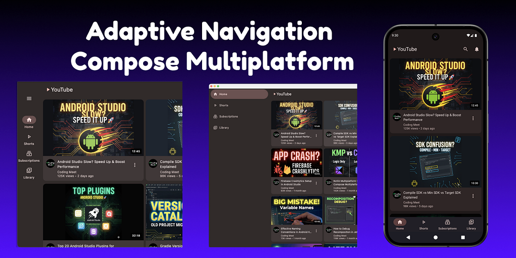
Modern apps are no longer limited to a single screen size.
Your UI must work smoothly on:
- 📱 Phones
- 📲 Foldable
- 💻 Tablets
- 🖥 Desktop
And not just work — it should feel natural on every device.
This is where adaptive navigation becomes critical.
In this article, we’ll build a fully adaptive navigation system using Compose Multiplatform (KMP) and Material 3 Adaptive Navigation Suite, where:
- Bottom navigation is used on phones
- Navigation rails appear on tablets
- Navigation drawers are shown on large screens and desktop
- All of this is driven by WindowSizeClass, not hardcoded screen sizes
Let’s get started!
Project Setup
If you haven’t already created a Compose Multiplatform project, head over to the Kotlin Multiplatform Wizard website.
- Select the platforms: Android, iOS, and Desktop.
- Make sure that the Share UI option is selected for iOS.
(This ensures your Compose UI code is reused across all platforms.) - Project Name: You can set this to AdaptiveNavCMP (or any name you like)
- Project ID: You can use com.example.adaptive_nav_cmp (or customize as needed)
After configuring your options, download the generated project template.
Once downloaded, open the project in Android Studio or IntelliJ IDEA.
Now you’re ready to implement cross-platform toast notifications!
1. Configure Dependencies for Adaptive Navigation (KMP)
To implement Material 3 Adaptive Navigation in a Kotlin Multiplatform (KMP) project, the first step is configuring the correct dependencies.
This ensures consistent behavior across phones, tablets, foldables, and desktop form factors.
1.1 Define Library Versions
Start by declaring all required library versions inside the Version Catalog.
Using a centralized version catalog keeps dependency management clean and maintainable.
[versions]# Material
material3-adaptive = "1.2.0"
material3WindowSizeClass = "1.9.0"
materialIconsExtended = "1.7.3"

# Navigation
androidx-navigation = "2.9.1"

# Serialization
kotlinx-serialization = "1.9.0"
1.2 Declare Library Coordinates
Next, map each version to its corresponding dependency.
This step defines which artifacts will be used by the project.
[libraries]# Material 3 Adaptive
material-icons-extended = { module = "org.jetbrains.compose.material:material-icons-extended", version.ref = "materialIconsExtended" }
material3 = { module = "org.jetbrains.compose.material3:material3", version.ref = "material3WindowSizeClass" }
material3-adaptive = { module = "org.jetbrains.compose.material3.adaptive:adaptive", version.ref = "material3-adaptive" }
material3-adaptive-navigation-suite = { module = "org.jetbrains.compose.material3:material3-adaptive-navigation-suite", version.ref = "material3WindowSizeClass" }
material3-window-size-class1 = { module = "org.jetbrains.compose.material3:material3-window-size-class", version.ref = "material3WindowSizeClass" }

# Navigation
androidx-navigation-compose = { module = "org.jetbrains.androidx.navigation:navigation-compose", version.ref = "androidx-navigation" }

# Serialization
kotlinx-serialization-json = { module = "org.jetbrains.kotlinx:kotlinx-serialization-json", version.ref = "kotlinx-serialization" }
1.3 Register Kotlin Serialization Plugin (Project Level)
The Kotlin serialization plugin must be registered at the project level.
Here, it is added without applying, allowing selective usage in modules.
// build.gradle.kts (Project)
plugins {
    // other existing plugins
    alias(libs.plugins.kotlinSerialization) apply false
}
1.4 Apply Serialization Plugin (Compose Module)
Apply the serialization plugin inside the Compose module where it is required.
// build.gradle.kts (composeApp module)
plugins {
    // other existing plugins
    alias(libs.plugins.kotlinSerialization)
}
1.5 Add Dependencies to commonMain
Finally, include all required libraries in the commonMain source set so they are available across all platforms supported by the KMP project.
sourceSets {
    commonMain.dependencies {

        // Material
        implementation(libs.material.icons.extended) // Optional: only required if Material icon vectors are used
        implementation(libs.material3)
        implementation(libs.material3.adaptive)
        implementation(libs.material3.adaptive.navigation.suite)
        implementation(libs.material3.window.size.class1)

        // Navigation & Serialization
        implementation(libs.androidx.navigation.compose)
        implementation(libs.kotlinx.serialization.json)
    }
}
At this point, the project is fully configured with all Material 3 adaptive, navigation, and serialization dependencies required for building an adaptive navigation system.
2. Define a Common WindowSizeClass API Using expect
To support adaptive layouts across all platforms (Android, iOS, Desktop) in a Kotlin Multiplatform project, the first step is defining a common API that can be shared everywhere.
This is done using Kotlin’s expect / actual mechanism.
2.1 Declare the expect Function in commonMain
Create a new Kotlin file inside the commonMain source set and declare an expect function that returns WindowSizeClass.
// composeApp/src/commonMain/kotlin/your_package_name/CalculateWindowSizeClass.kt

import androidx.compose.material3.windowsizeclass.WindowSizeClass
import androidx.compose.runtime.Composable

@Composable
expect fun calculateWindowSizeClass(): WindowSizeClass
This function acts as a platform-agnostic contract that every target platform must implement.
expect means: “There will be an actual implementation for every platform (Android, iOS, Desktop).”
2.2. Add actual Implementations for Each Platform
After you declare the expect class, your IDE (IntelliJ IDEA/Android Studio) will show a warning like:
Expected function calculateWindowSizeClass has no actual declaration in module JVM / Native
You will see a lightbulb or a popup with the option:
“Add missing actual declarations”
- Hover over calculateWindowSizeClass or the warning to see this popup:

IDE warning: “Expected class ‘calculateWindowSizeClass’ has no actual declaration…”
2. Click on “Add missing actual declarations.”
A new dialog will open where you can select the source sets:

Select the source sets (jvmMain, androidMain, iosMain) for your actual implementations and click OK.
2.3 Implement actual Functions for Each Platform
Once the IDE generates the missing actual declarations, you need to implement the real logic for each platform.
Each implementation returns the current WindowSizeClass using the platform-appropriate API.
2.3.1 JVM / Desktop Implementation
For Desktop (JVM), WindowSizeClass can be calculated directly without any platform context.
// composeApp/src/jvmMain/kotlin/your_package_name/CalculateWindowSizeClass.jvm.kt

import androidx.compose.material3.windowsizeclass.ExperimentalMaterial3WindowSizeClassApi
import androidx.compose.material3.windowsizeclass.WindowSizeClass
import androidx.compose.material3.windowsizeclass.calculateWindowSizeClass
import androidx.compose.runtime.Composable

@OptIn(ExperimentalMaterial3WindowSizeClassApi::class)
@Composable
actual fun calculateWindowSizeClass(): WindowSizeClass {
    return calculateWindowSizeClass()
}
2.3.2 Android Implementation
On Android, the calculateWindowSizeClass function requires an Activity.
This is obtained using LocalActivity.current.
// composeApp/src/androidMain/kotlin/your_package_name/CalculateWindowSizeClass.android.kt

import androidx.activity.compose.LocalActivity
import androidx.compose.material3.windowsizeclass.ExperimentalMaterial3WindowSizeClassApi
import androidx.compose.material3.windowsizeclass.WindowSizeClass
import androidx.compose.material3.windowsizeclass.calculateWindowSizeClass
import androidx.compose.runtime.Composable

@OptIn(ExperimentalMaterial3WindowSizeClassApi::class)
@Composable
actual fun calculateWindowSizeClass(): WindowSizeClass {
    return calculateWindowSizeClass(LocalActivity.current!!)
}
2.3.3 iOS Implementation
On iOS, the Material window size class API can be used directly, similar to the Desktop implementation.
// composeApp/src/iosMain/kotlin/your_package_name/CalculateWindowSizeClass.ios.kt

import androidx.compose.material3.windowsizeclass.ExperimentalMaterial3WindowSizeClassApi
import androidx.compose.material3.windowsizeclass.WindowSizeClass
import androidx.compose.material3.windowsizeclass.calculateWindowSizeClass
import androidx.compose.runtime.Composable

@OptIn(ExperimentalMaterial3WindowSizeClassApi::class)
@Composable
actual fun calculateWindowSizeClass(): WindowSizeClass {
    return calculateWindowSizeClass()
}
With these implementations in place, the shared calculateWindowSizeClass() function now works uniformly across Android, iOS, and Desktop, allowing adaptive UI logic to be written entirely in common code.
3. Define Routes and Navigation Structure (Example)
At this stage, we will take a simple example to understand how navigation can be structured in a Compose application.
This example is only meant to demonstrate the navigation pattern.
You are free to define your own screens and routes based on your application’s requirements.
3.1 Define Application Routes
All navigation destinations are represented using a sealed interface called Route.
Each route corresponds to a screen in the app.
sealed interface Route {

    @Serializable
    data object HomeRoute : Route

    @Serializable
    data object ShortsRoute : Route

    @Serializable
    data object SubscriptionsRoute : Route

    @Serializable
    data object LibraryRoute : Route

    @Serializable
    data class VideoDetailRoute(
        val videoId: String
    ) : Route
}
3.2 Create the Navigation Host
The navigation graph is defined using NavHost.
This function connects each route to its corresponding composable screen.
@Composable
fun AppNavHost(
    navController: NavHostController
) {
    NavHost(
        navController = navController,
        startDestination = Route.HomeRoute
    ) {
The startDestination defines the first screen shown when the app launches.
Important:
We will discuss where and how AppNavHost should be called in a later step.
3.3 Map Routes to Screens
Each route is mapped to a composable using the composable<Route>().
3.3.1 Home Route with Navigation to Detail Screen
The Home screen displays a list of videos.
When a video is clicked, navigation occurs to a detail screen using a parameterized route.
        composable<Route.HomeRoute> {
            VideoListScreen(
                videos = DummyData.videos,
                onVideoClick = { video ->
                    navController.navigate(
                        Route.VideoDetailRoute(video.id)
                    )
                }
            )
        }
3.3.2 Static Example Screens
The following routes use a shared placeholder screen.
These screens are only for demonstration purposes.
        composable<Route.ShortsRoute> {
            CenterTextScreen("Shorts")
        }
        composable<Route.SubscriptionsRoute> {
            CenterTextScreen("Subscriptions")
        }
        composable<Route.LibraryRoute> {
            CenterTextScreen("Library")
        }
You can replace these with your own composables as needed.
3.3.3 Route with Arguments (Video Detail)
This route demonstrates how to pass and read arguments during navigation.
        composable<Route.VideoDetailRoute> { backStackEntry ->
            val route = backStackEntry.toRoute<Route.VideoDetailRoute>()
            val video =
                DummyData.videos.find { it.id == route.videoId }
            video?.let {
                VideoDetailScreen(
                    video = it,
                    onBackClick = {
                        navController.navigateUp()
                    }
                )
            }
        }
4. Navigation Items and Route Awareness (Two Possible Approaches)
At this stage, we prepare the building blocks required to connect navigation routes with adaptive navigation UI.
There are two possible approaches to implement adaptive navigation in a Compose application:
- Using the inbuilt NavigationSuiteScaffold behavior (System-driven)
- Using a fully custom NavigationSuiteScaffold implementation (Custom-driven)
In this step, we only define shared navigation data and helpers that will be reused by both approaches.
4.1 Define Top-Level Navigation Items
We define all top-level navigation destinations using an enum class called NavItem.
Each NavItem:
- Maps directly to a Route
- Defines selected and unselected icons
- Provides a label for the navigation UI
enum class NavItem(
    val route: Route,
    val selectedIcon: ImageVector,
    val unselectedIcon: ImageVector,
    val label: String
) {
    HOME(
        route = Route.HomeRoute,
        selectedIcon = Icons.Filled.Home,
        unselectedIcon = Icons.Outlined.Home,
        label = "Home"
    ),
    SHORTS(
        route = Route.ShortsRoute,
        selectedIcon = Icons.Filled.PlayArrow,
        unselectedIcon = Icons.Outlined.PlayArrow,
        label = "Shorts"
    ),
    SUBSCRIPTIONS(
        route = Route.SubscriptionsRoute,
        selectedIcon = Icons.Filled.Subscriptions,
        unselectedIcon = Icons.Outlined.Subscriptions,
        label = "Subscriptions"
    ),
    LIBRARY(
        route = Route.LibraryRoute,
        selectedIcon = Icons.Filled.VideoLibrary,
        unselectedIcon = Icons.Outlined.VideoLibrary,
        label = "Library"
    )
}
4.2 Check Whether a Route Exists in the Navigation Hierarchy
To correctly determine which navigation item should be marked as selected, we need to check whether a route exists anywhere in the current destination hierarchy.
fun NavBackStackEntry?.isRouteInHierarchy(route: KClass<*>) =
    this?.destination?.hierarchy?.any {
        it.hasRoute(route)
    } == true
5. Approach 1: System-Based Adaptive Navigation (Using Inbuilt NavigationSuiteScaffold)
In this approach, we rely on Material 3’s inbuilt adaptive behavior to decide whether the app should display a Bottom Navigation Bar or a Navigation Rail, based on the current device configuration.
5.1 Create a Wrapper Around NavigationSuiteScaffold
We create a small wrapper composable around NavigationSuiteScaffold.
This helps keep the navigation-related code isolated and reusable.
import androidx.compose.material3.*
import androidx.compose.material3.adaptive.navigationsuite.*
import androidx.compose.runtime.Composable

@Composable
fun SystemNavigationSuiteScaffold(
    navigationSuiteState: NavigationSuiteScaffoldState,
    layoutType: NavigationSuiteType,
    currentNavigationItem: NavItem?,
    onNavigationItemClick: (NavItem) -> Unit,
    content: @Composable () -> Unit
) {
    NavigationSuiteScaffold(
        state = navigationSuiteState,
        navigationSuiteItems = {
            systemNavBar(
                currentNavigationItem = currentNavigationItem,
                onNavigationItemClick = onNavigationItemClick
            )
        },
        layoutType = layoutType,
        navigationSuiteColors = NavigationSuiteDefaults.colors(
            /*
             * Custom colors can be defined here to override
             * the default Material 3 adaptive behavior.
             */
        ),
        containerColor = MaterialTheme.colorScheme.background,
        contentColor = MaterialTheme.colorScheme.onBackground,
        content = content
    )
}
5.2 Define Navigation Items Using NavigationSuiteScope
Navigation items are defined using an extension function on NavigationSuiteScope.
fun NavigationSuiteScope.systemNavBar(
    currentNavigationItem: NavItem?,
    onNavigationItemClick: (NavItem) -> Unit
) {
    NavItem.entries.forEach { navItem ->

        val selected = currentNavigationItem == navItem

        item(
            icon = {
                Icon(
                    imageVector = if (selected)
                        navItem.selectedIcon
                    else
                        navItem.unselectedIcon,
                    contentDescription = navItem.label
                )
            },
            label = { Text(navItem.label) },
            selected = selected,
            onClick = {
                onNavigationItemClick(navItem)
            }
        )
    }
}
5.3 Decide the Layout Type Using Adaptive Info
Material provides currentWindowAdaptiveInfo() to detect:
- Screen size
- Device posture
val windowAdaptiveInfo = currentWindowAdaptiveInfo()
Using this information, the system calculates the appropriate navigation layout.
val inbuiltLayoutType =
    NavigationSuiteScaffoldDefaults.calculateFromAdaptiveInfo(
        adaptiveInfo = windowAdaptiveInfo
    )
Important Note:
When using inbuilt NavigationSuiteScaffold, you should rely on
NavigationSuiteScaffoldDefaults.calculateFromAdaptiveInfo(…)
This typically returns only:
- NavigationSuiteType.NavigationBar
- NavigationSuiteType.NavigationRail
Using this method avoids padding and inset issues.
5.4 Integrate Navigation Inside the App Root
Now we connect navigation, adaptive layout, and routes inside the main App composable.
@Composable
fun App() {
    YoutubeTheme {

        val navController = rememberNavController()
        val navigationSuiteState = rememberNavigationSuiteScaffoldState()
        val navBackStackEntry by navController.currentBackStackEntryAsState()
5.5 Detect the Currently Selected Navigation Item
We derive the active navigation item from the navigation back stack.
        val currentNavigationItem by remember(navBackStackEntry) {
            derivedStateOf {
                NavItem.entries.find { navigationItem ->
                    navBackStackEntry.isRouteInHierarchy(
                        navigationItem.route::class
                    )
                }
            }
        }
5.6 Show or Hide Navigation Automatically
        LaunchedEffect(currentNavigationItem) {
            if (currentNavigationItem != null) {
                navigationSuiteState.show()
            } else {
                navigationSuiteState.hide()
            }
        }
Behavior:
- Top-level screens → Navigation visible
- Detail screens → Navigation hidden (full-screen experience)
5.7 Connect Navigation with Routes
        SystemNavigationSuiteScaffold(
            navigationSuiteState = navigationSuiteState,
            layoutType = inbuiltLayoutType,
            currentNavigationItem = currentNavigationItem,
            onNavigationItemClick = { navItem ->
                navController.navigate(navItem.route) {
                    popUpTo(Route.HomeRoute) {
                        saveState = true
                    }
                    launchSingleTop = true
                    restoreState = true
                }
            },
            content = {
                AppNavHost(navController = navController)
            }
        )
    }
}
Limitations of Approach 1
This approach is great for most apps, but it has limitations:
Limited control over layout switching
Cannot safely use:
- ShortNavigationBarCompact
- ShortNavigationBarMedium
- WideNavigationRailCollapsed
Because of these limitations, Approach 2 (Custom Navigation Suite) is often required for advanced layouts.
6. Approach 2: Fully Custom Adaptive Navigation Suite (Custom NavigationSuiteType + Custom Layout & Padding Control)
In Approach 1, we relied on Material’s inbuilt behavior to decide the navigation layout.
While that approach is simple, it offers limited control.
In Approach 2, we take full control over:
- Which navigation layout is used
- When it changes
- How padding and insets are applied to the main content
This approach is recommended when you want precise behavior across phones, tablets, and desktop.
6.1 Define a Custom NavigationSuiteType Mapping
We start by defining our own function that maps a WindowSizeClass to a specific NavigationSuiteType.
fun customNavigationSuiteType(
    windowSizeClass: WindowSizeClass
): NavigationSuiteType {

    val width = windowSizeClass.widthSizeClass
    val height = windowSizeClass.heightSizeClass

    return when (width) {

        // Phones
        WindowWidthSizeClass.Compact -> {
            NavigationSuiteType.ShortNavigationBarCompact
        }

        // Large phones / small tablets
        WindowWidthSizeClass.Medium -> {
            when (height) {
                WindowHeightSizeClass.Compact ->
                    // Landscape / split screen
                    NavigationSuiteType.NavigationBar

                WindowHeightSizeClass.Medium,
                WindowHeightSizeClass.Expanded ->
                    NavigationSuiteType.ShortNavigationBarMedium

                else ->
                    NavigationSuiteType.ShortNavigationBarMedium
            }
        }

        // Tablets / Desktop
        WindowWidthSizeClass.Expanded -> {
            when (height) {
                WindowHeightSizeClass.Expanded -> {
                    // Desktop / ChromeOS
                    NavigationSuiteType.NavigationDrawer
                }

                WindowHeightSizeClass.Compact -> {
                    // Landscape tablet / short window
                    NavigationSuiteType.NavigationRail
                }

                WindowHeightSizeClass.Medium -> {
                    NavigationSuiteType.WideNavigationRailCollapsed
                }

                else -> NavigationSuiteType.WideNavigationRailCollapsed
            }
        }

        else -> NavigationSuiteType.ShortNavigationBarCompact
    }
}
6.2 Handle Content Padding Manually
When using a custom NavigationSuiteType, Material does not automatically handle padding for you.
Because of this, we must calculate and apply window insets manually.
@Composable
fun MainContentBox(
    navigationSuiteState: NavigationSuiteScaffoldState,
    layoutType: NavigationSuiteType,
    content: @Composable BoxScope.() -> Unit
) {
    Box(
        modifier = Modifier
            .fillMaxSize()
            .consumeWindowInsets(
                if (
                    navigationSuiteState.currentValue ==
                    NavigationSuiteScaffoldValue.Hidden &&
                    !navigationSuiteState.isAnimating
                ) {
                    WindowInsets() // NoWindowInsets
                } else {
                    when (layoutType) {
                        NavigationSuiteType.ShortNavigationBarCompact,
                        NavigationSuiteType.ShortNavigationBarMedium,
                        NavigationSuiteType.NavigationBar ->
                            NavigationBarDefaults.windowInsets.only(
                                WindowInsetsSides.Bottom
                            )

                        NavigationSuiteType.NavigationRail ->
                            NavigationRailDefaults.windowInsets.only(
                                WindowInsetsSides.Start
                            )

                        NavigationSuiteType.NavigationDrawer ->
                            DrawerDefaults.windowInsets.only(
                                WindowInsetsSides.Start
                            )

                        else -> WindowInsets()
                    }
                }
            ),
        content = content
    )
}
Note:
When using a custom NavigationSuiteType with a custom navigation scaffold, you must calculate and apply padding manually, otherwise layout issues will occur.
6.3 Create a Fully Custom NavigationSuiteScaffoldLayout
Instead of using the inbuilt NavigationSuiteScaffold, we use
NavigationSuiteScaffoldLayout and render each navigation UI manually.
@Composable
fun CustomNavigationSuiteScaffoldLayout(
    navigationSuiteState: NavigationSuiteScaffoldState,
    layoutType: NavigationSuiteType,
    currentNavigationItem: NavItem?,
    onNavigationItemClick: (NavItem) -> Unit,
    colors: NavigationSuiteColors = NavigationSuiteDefaults.colors(),
    content: @Composable BoxScope.() -> Unit,
) {
Inside this layout:
- Bottom bar
- Navigation rail
- Wide rail
- Navigation drawer
are all handled explicitly.
This gives you full design and behavior control.
6.4 Control Wide Navigation Rail State Explicitly
For wide navigation rails, we also manage the expanded / collapsed state manually.
    val scope = rememberCoroutineScope()
    val wideNavigationRailState = rememberWideNavigationRailState()
    LaunchedEffect(layoutType) {
        when (layoutType) {
            NavigationSuiteType.WideNavigationRailExpanded ->
                wideNavigationRailState.expand()

            NavigationSuiteType.WideNavigationRailCollapsed ->
                wideNavigationRailState.collapse()

            else -> Unit
        }
    }
6.5 Render Navigation UI Based on Layout Type
Depending on layoutType, we render the appropriate navigation UI:
- ShortNavigationBar
- WideNavigationRail
- NavigationRail
- PermanentDrawerSheet
Each UI:
- Uses the same NavItem data
- Highlights the current selection
- Triggers navigation on click
This keeps UI and navigation logic decoupled.
    NavigationSuiteScaffoldLayout(
        state = navigationSuiteState,
        navigationSuite = {
            when (layoutType) {
                NavigationSuiteType.ShortNavigationBarCompact,
                NavigationSuiteType.ShortNavigationBarMedium,
                NavigationSuiteType.NavigationBar -> {
                    ShortNavigationBar(
                        modifier = Modifier,
                        containerColor = colors.shortNavigationBarContainerColor,
                        contentColor = colors.shortNavigationBarContentColor,
                        content = {
                            NavItem.entries.forEach { item ->
                                ShortNavigationBarItem(
                                    iconPosition = if (layoutType == NavigationSuiteType.ShortNavigationBarCompact) NavigationItemIconPosition.Top else NavigationItemIconPosition.Start,
                                    icon = {
                                        Icon(
                                            imageVector = if (currentNavigationItem == item) item.selectedIcon else item.unselectedIcon,
                                            contentDescription = null,
                                        )
                                    },
                                    label = { Text(item.label) },
                                    selected = currentNavigationItem == item,
                                    onClick = { onNavigationItemClick(item) },
                                )
                            }
                        },
                    )
                }

                NavigationSuiteType.WideNavigationRailCollapsed,
                NavigationSuiteType.WideNavigationRailExpanded -> {
                    WideNavigationRail(
                        state = wideNavigationRailState,
                        modifier = Modifier,
                        header = {
                            IconButton(
                                modifier = Modifier.padding(start = 24.dp),
                                onClick = {
                                    scope.launch {
                                        if (wideNavigationRailState.targetValue == WideNavigationRailValue.Expanded)
                                            wideNavigationRailState.collapse()
                                        else wideNavigationRailState.expand()
                                    }
                                },
                            ) {
                                if (wideNavigationRailState.targetValue == WideNavigationRailValue.Expanded) {
                                    Icon(Icons.AutoMirrored.Filled.MenuOpen, "Collapse rail")
                                } else {
                                    Icon(Icons.Filled.Menu, "Expand rail")
                                }
                            }
                        },
                        colors = colors.wideNavigationRailColors,
                        content = {
                            NavItem.entries.forEach { item ->
                                WideNavigationRailItem(
                                    modifier = Modifier.padding(
                                        if (wideNavigationRailState.targetValue == WideNavigationRailValue.Expanded) 5.dp else 0.dp
                                    ),
                                    iconPosition = if (wideNavigationRailState.targetValue == WideNavigationRailValue.Expanded) {
                                        NavigationItemIconPosition.Start
                                    } else {
                                        NavigationItemIconPosition.Top
                                    },
                                    icon = {
                                        Icon(
                                            imageVector = if (currentNavigationItem == item) item.selectedIcon else item.unselectedIcon,
                                            contentDescription = null,
                                        )
                                    },
                                    label = { Text(item.label) },
                                    selected = currentNavigationItem == item,
                                    onClick = { onNavigationItemClick(item) },
                                    railExpanded = wideNavigationRailState.targetValue == WideNavigationRailValue.Expanded,
                                )
                            }
                        },
                    )
                }

                NavigationSuiteType.NavigationRail -> {
                    NavigationRail(
                        modifier = Modifier,
                        header = { },
                        containerColor = colors.navigationRailContainerColor,
                        contentColor = colors.navigationRailContentColor,
                    ) {
                        Spacer(Modifier.weight(1f))
                        NavItem.entries.forEach { item ->
                            NavigationRailItem(
                                icon = {
                                    Icon(
                                        imageVector = if (currentNavigationItem == item) item.selectedIcon else item.unselectedIcon,
                                        contentDescription = null,
                                    )
                                },
                                label = { Text(item.label) },
                                selected = currentNavigationItem == item,
                                onClick = { onNavigationItemClick(item) },
                            )
                        }
                        Spacer(Modifier.weight(1f))
                    }
                }

                NavigationSuiteType.NavigationDrawer -> {
                    PermanentDrawerSheet(
                        modifier = Modifier,
                        drawerContainerColor = colors.navigationDrawerContainerColor,
                        drawerContentColor = colors.navigationDrawerContentColor,
                    ) {
                        NavItem.entries.forEach { item ->
                            NavigationDrawerItem(
                                modifier = Modifier.padding(vertical = 5.dp, horizontal = 10.dp),
                                icon = {
                                    Icon(
                                        imageVector = if (currentNavigationItem == item) item.selectedIcon else item.unselectedIcon,
                                        contentDescription = null,
                                    )
                                },
                                label = { Text(item.label) },
                                selected = currentNavigationItem == item,
                                onClick = { onNavigationItemClick(item) },
                            )
                        }
                    }
                }
            }
        },
        layoutType = layoutType,
        content = {
            MainContentBox(
                navigationSuiteState = navigationSuiteState,
                layoutType = layoutType,
                content = content
            )
        }
    )
}
Note:
If you use a custom NavigationSuiteType with a custom navigation scaffold, you must also handle content padding using MainContentBox.
6.6 Integrate Custom Navigation Into the App
Finally, we integrate everything inside the App composable.
@Composable
fun App() {
    YoutubeTheme {
        val navController = rememberNavController()
        val navigationSuiteState = rememberNavigationSuiteScaffoldState()
        val navBackStackEntry by navController.currentBackStackEntryAsState()
6.7 Detect the Currently Selected Navigation Item
We derive the active navigation item from the navigation back stack.
        val currentNavigationItem by remember(navBackStackEntry) {
            derivedStateOf {
                NavItem.entries.find { navigationItem ->
                    navBackStackEntry.isRouteInHierarchy(
                        navigationItem.route::class
                    )
                }
            }
        }
6.8 Show or Hide Navigation Automatically
        LaunchedEffect(currentNavigationItem) {
            if (currentNavigationItem != null) {
                navigationSuiteState.show()
            } else {
                navigationSuiteState.hide()
            }
        }
Behavior:
- Top-level screens → Navigation visible
- Detail screens → Navigation hidden (full-screen experience)
6.9 Integrate Custom Navigation Into the App
Finally, we integrate everything inside the App composable.
        val windowSizeClass = calculateWindowSizeClass()
        val customLayoutType = customNavigationSuiteType(windowSizeClass)

        // Example 2
        CustomNavigationSuiteScaffoldLayout(
            navigationSuiteState = navigationSuiteState,
            layoutType = customLayoutType,
            currentNavigationItem = currentNavigationItem,
            onNavigationItemClick = { navItem ->
                navController.navigate(navItem.route) {
                    popUpTo(Route.HomeRoute) {
                        saveState = true
                    }
                    launchSingleTop = true
                    restoreState = true
                }
            },
            content = {
                AppNavHost(navController = navController)
            }
        )
    }
}
That’s it!
You can explore the complete source code and video on GitHub:
GitHub – Coding-Meet/AdaptiveNavCMP
Important Notes
When working with adaptive navigation (Bottom Bar, Navigation Rail, Drawer), Scaffold placement becomes extremely important.
A small mistake here can easily lead to:
- Double padding
- Inconsistent behavior across screen sizes
Do Not Use Scaffold at the Root App Level
In this architecture:
- ❌ The root App() composable should NOT use Scaffold
- ❌ Do NOT apply system bar or navigation padding globally
Why?
Because:
- Navigation UI (Bottom Bar / Rail / Drawer) is handled by
NavigationSuiteScaffold or NavigationSuiteScaffoldLayout - Padding requirements change dynamically based on:
- Navigation type
- Navigation visibility
- Screen size
Applying a root Scaffold will cause:
- Double insets
- Incorrect spacing when switching layouts
Use MainContentBox as the Navigation-Aware Wrapper
When you use a custom navigation setup, you must handle padding manually.
That is the responsibility of:
MainContentBox(
    navigationSuiteState = navigationSuiteState,
    layoutType = layoutType
) {
    // Screen content here
}
MainContentBox:
- Applies correct window insets
- Adjusts padding for: Bottom navigation/Navigation rail/Navigation drawer
This ensures only one place is responsible for navigation padding.
When Using Scaffold with TopAppBar / Bottom UI
If a screen uses:
- TopAppBar
- BottomAppBar
- FAB
Then using Scaffold is safe and recommended, because:
- The Scaffold will correctly handle status bar and navigation bar insets
- Your content will not overlap system bars
Example:
@Composable
fun HomeScreen() {
    Scaffold(
        topBar = { /* TopAppBar */ }
    ) {
        // Screen content
    }
}
In this case, no manual padding is required.
Edge-to-Edge Screens Without TopAppBar
If you are using edge-to-edge UI and:
- ❌ No TopAppBar
- ❌ No BottomBar
- ❌ Full-screen content (video, image, feed)
Then content can overlap the system bars.
In this situation, you must apply manual insets padding.
Status Bar Padding
Modifier.padding(
    WindowInsets.statusBars.asPaddingValues()
)
Navigation Bar Padding
Modifier.padding(
    WindowInsets.navigationBars.asPaddingValues()
)
Status Bar Padding + Navigation Bar Padding
Modifier.padding(
    WindowInsets.systemBars.asPaddingValues()
)
This ensures:
- Content does not go under the status bar
- Content does not clash with gesture navigation or system buttons
If you’re interested in learning more about Kotlin Multiplatform and Compose Multiplatform, check out my playlist on YouTube Channel:
Kotlin Multiplatform & Compose Multiplatform
Thank you for reading! 🙌🙏✌ I hope you found this guide useful.
Don’t forget to clap 👏 to support me and follow for more insightful articles about Android Development, Kotlin, and KMP. If you need any help related to Android, Kotlin, and KMP, I’m always happy to assist.
Explore More Projects
If you’re interested in seeing full applications built with Kotlin Multiplatform and Jetpack Compose, check out these open-source projects:
- DevAnalyzer (Supports Windows, macOS, Linux):
DevAnalyzer helps developers analyze, understand, and optimize their entire development setup — from project structure to SDK and IDE storage — all in one unified tool.
GitHub Repository: DevAnalyzer - Pokemon App — MVI Compose Multiplatform Template (Supports Android, iOS, Windows, macOS, Linux):
A beautiful, modern Pokemon application built with Compose Multiplatform featuring MVI architecture, type-safe navigation, and dynamic theming. Explore Pokemon, manage favorites, and enjoy a seamless experience across Android, Desktop, and iOS platforms.
GitHub Repository: CMP-MVI-Template - News Kotlin Multiplatform App (Supports Android, iOS, Windows, macOS, Linux):
News KMP App is a Kotlin Compose Multiplatform (KMP) project that aims to provide a consistent news reading experience across multiple platforms, including Android, iOS, Windows, macOS, and Linux. This project leverages Kotlin’s multiplatform capabilities to share code and logic while using Compose for UI, ensuring a seamless and native experience on each platform.
GitHub Repository: News-KMP-App - Gemini AI Kotlin Multiplatform App (Supports Android, iOS, Windows, macOS, Linux, and Web):
Gemini AI KMP App is a Kotlin Compose Multiplatform project designed by Gemini AI where you can retrieve information from text and images in a conversational format. Additionally, it allows storing chats group-wise using SQLDelight and KStore, and facilitates changing the Gemini API key.
GitHub Repository: Gemini-AI-KMP-App
Follow me on
My Portfolio Website , YouTube , GitHub , Instagram , LinkedIn , Buy Me a Coffee , Twitter , DM Me For Freelancing Project
Building a Fully Adaptive Navigation System in Compose Multiplatform (KMP) was originally published in ProAndroidDev on Medium, where people are continuing the conversation by highlighting and responding to this story.


This Post Has 0 Comments