
Hello Folks! Previously, I explored how to use AGSL shaders to create an immersive Landing Page experience. If you haven’t checked that out yet, I highly recommend giving it a read to get familiar with the basics.
Exploring AGSL Effects in a Single Landing Page View
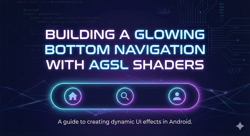
In this article, I will going to apply those same powerful concepts to a more specific component. I will walk through building a Glowing Bottom Navigation, using shaders to create a dynamic, premium lighting effect for our app menus.
Case Study Component
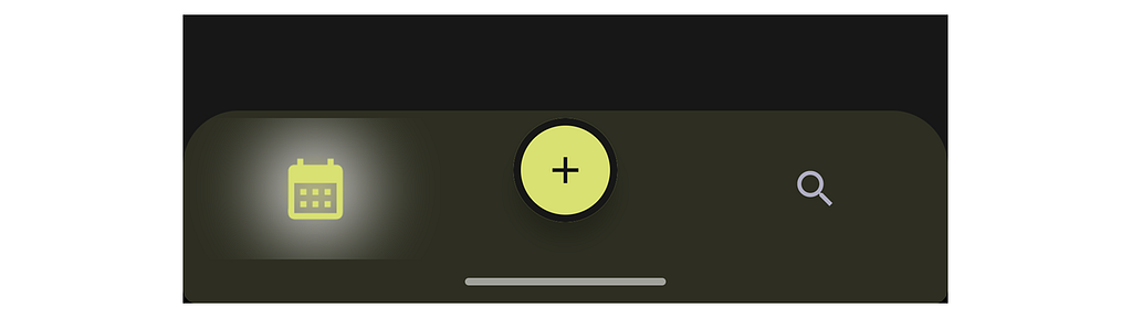
Now, let’s dive into the component itself. For this case study, I’ve chosen a Bottom Navigation interface. The goal is to take a standard navigation pattern and elevate it with our glow effect. Here is a visual reference of what we are building.
With the component design established, we can move on to the implementation. Let’s start building the AGSL script that will handle the coordinate calculations and the light falloff. Let’s dive into the code to see how the math comes together.
const val GLOW_SHADER = """
uniform float2 resolution;
uniform float progress;
uniform float3 color;
half4 main(float2 coords) {
float2 center = resolution * 0.5;
float dist = distance(coords, center);
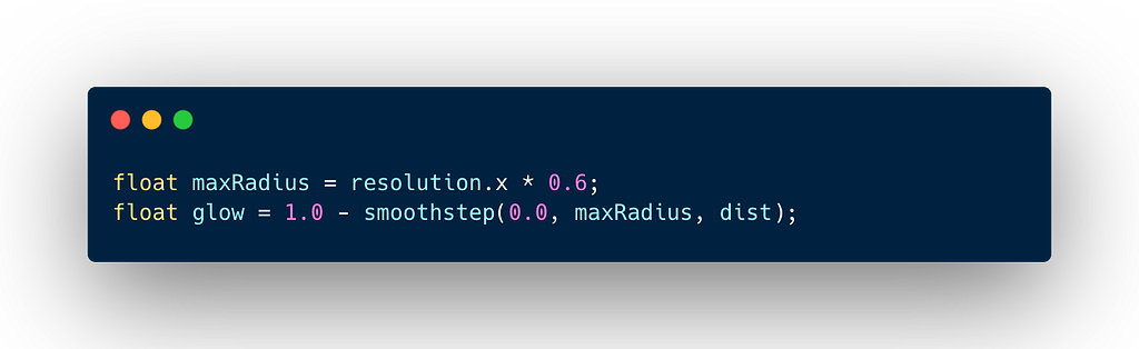
float maxRadius = resolution.x * 0.6;
float glow = 1.0 - smoothstep(0.0, maxRadius, dist);
glow = glow * glow;
float alpha = glow * progress * 0.4;
return half4(color, alpha);
}
"""
Here the technical breakdown of the code above. Basically we create radial glow effect that originates from the center of the drawing area. It uses a distance field to calculate brightness, creating a soft fade-out from the center to edges.

These are the dynamic parameters passed from our Kotlin code into the shader.
- uniform float2 resolution → The width and height of the UI component (Canvas/Box) in pixels. This is crucial for normalizing coordinates.
- uniform float progress → A control value (likely animated between 0.0 and 1.0) that determines the intensity or opacity of the glow.
- uniform float3 color → The RGB color of the glow.

The core of this shader relies on a Distance Field calculation. To make that work, we effectively reset our coordinate system by locating the exact center point of the canvas.
- center = resolution * 0.5 → We calculate the exact center of the drawing area by halving the resolution (x/2, y/2).
- distance(coords, center) → The distance() function calculates how far the current pixel coords is from that center point. This creates a circular distance field pixels closer to the center have a lower dist value, and pixels further away have a higher value.
The above is the core math that defines the softness of the light.
- maxRadius → The glow is constrained to a radius that is 60% of the component’s width.
- smoothstep → The smoothstep(0.0, maxRadius, dist) function returns 0.0 at the center (where dist is 0) and smoothly interpolates to 1.0 at the edge (where dist is maxRadius).
- 1.0 — smoothstep(…) → We flip the logic, Center value becomes 1.0 (Brightest). Edge (maxRadius) value becomes 0.0 (Invisible).

The line is a easy way to adjust the gamma or curve of the gradient. Squaring the value (y = x²) makes the falloff sharper. Values near 1.0 (center) stay high, but values in the middle drop off faster. This prevents the glow from looking linear or flat, giving it a more natural.
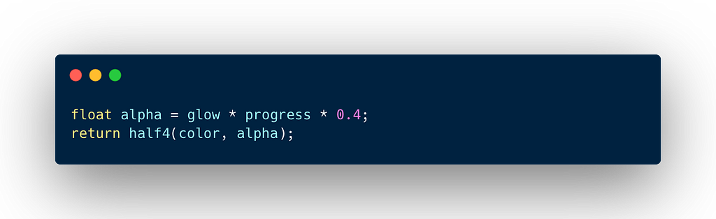
In this final step, we combine our spatial glow logic with the animation progress to determine the exact transparency of the output color.
- alpha calculation → The transparency is a combination of three factors. First is glow, the spatial fade-out we calculated above. Second is progress, the animation state (allowing you to pulse or fade the effect in/out). The last is 0.4, a hard cap on intensity, ensuring the glow never exceeds 40% opacity, keeping it subtle.
- half4(color, alpha) → The function returns a half4 (RGBA), applying the calculated alpha to your input color.
Create Custom Bottom Item Menu
The shader is ready, now we need a surface to draw it on. Let’s build the BottomNavigationItem composable. This code handles the selection logic and wraps our GLOW_SHADER inside a RuntimeShader for rendering.
@Composable
fun RowScope.BottomNavigationItem(
    icon: ImageVector,
    label: String,
    selected: Boolean,
    onClick: () -> Unit
) {
    val selectionProgress by animateFloatAsState(
        targetValue = if (selected) 1.5f else 0f,
        animationSpec = tween(durationMillis = 300),
        label = "GlowAnimation"
    )

    val scale by animateFloatAsState(
        targetValue = if (selected) 1.5f else 1.0f,
        animationSpec = spring(
            dampingRatio = Spring.DampingRatioHighBouncy,
            stiffness = Spring.StiffnessMedium
        ),
        label = "BounceAnimation"
    )

    val primaryColor = MaterialTheme.colorScheme.primary
    val iconColor = if (selected) MaterialTheme.colorScheme.primary else TextGray

    val shaderModifier = if (Build.VERSION.SDK_INT >= Build.VERSION_CODES.TIRAMISU) {
        val shader = remember { RuntimeShader(GLOW_SHADER) }
        Modifier.drawWithCache {
            val brush = ShaderBrush(shader)
            shader.setFloatUniform("resolution", size.width, size.height)
            shader.setFloatUniform("progress", selectionProgress)
            shader.setFloatUniform("color", primaryColor.red, primaryColor.green, primaryColor.blue)

            onDrawBehind {
                drawRect(brush)
            }
        }
    } else {
        Modifier
    }

    Column(
        horizontalAlignment = Alignment.CenterHorizontally,
        verticalArrangement = Arrangement.Center,
        modifier = Modifier
            .fillMaxHeight()
            .weight(1f)
            .clickable { onClick() }
            .then(shaderModifier)
    ) {
        Icon(
            imageVector = icon,
            contentDescription = label,
            tint = iconColor,
            modifier = Modifier
                .size(26.dp)
                .graphicsLayer {
                    scaleX = scale
                    scaleY = scale
                }
        )
    }
}
Here is a breakdown of the code above. I’ve grouped the explanation into logical steps, such as the animation state, the shaders implementation, and the final composition.
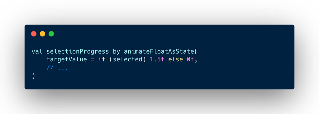
- selectionProgress → We use a standard tween animation. This value (0f to 1.5f) is passed to the shader to control the opacity and spread of the glow.
- scale → We use a spring animation with high bounciness. This scales the icon up when selected, giving it a tactile, playful feel.

- Version Check → RuntimeShader was introduced in Android 13/Tiramisu. We wrap the logic in a version check to ensure backward compatibility. Older devices simply won’t render the glow, failing gracefully.
- drawWithCache → We use this instead of a standard drawBehind for performance. It allows us to create the ShaderBrush once and reuse it, only updating the Uniforms when the size or state changes.
- onDrawBehind: Crucially, we draw the shader behind the content so the glow appears underneath the icon.
- resolution → We pass size.width and size.height so the shader knows where the center is.
- progress → We pass the animated selectionProgress value.
- color → We extract the Red, Green, and Blue components from our Compose primaryColor.
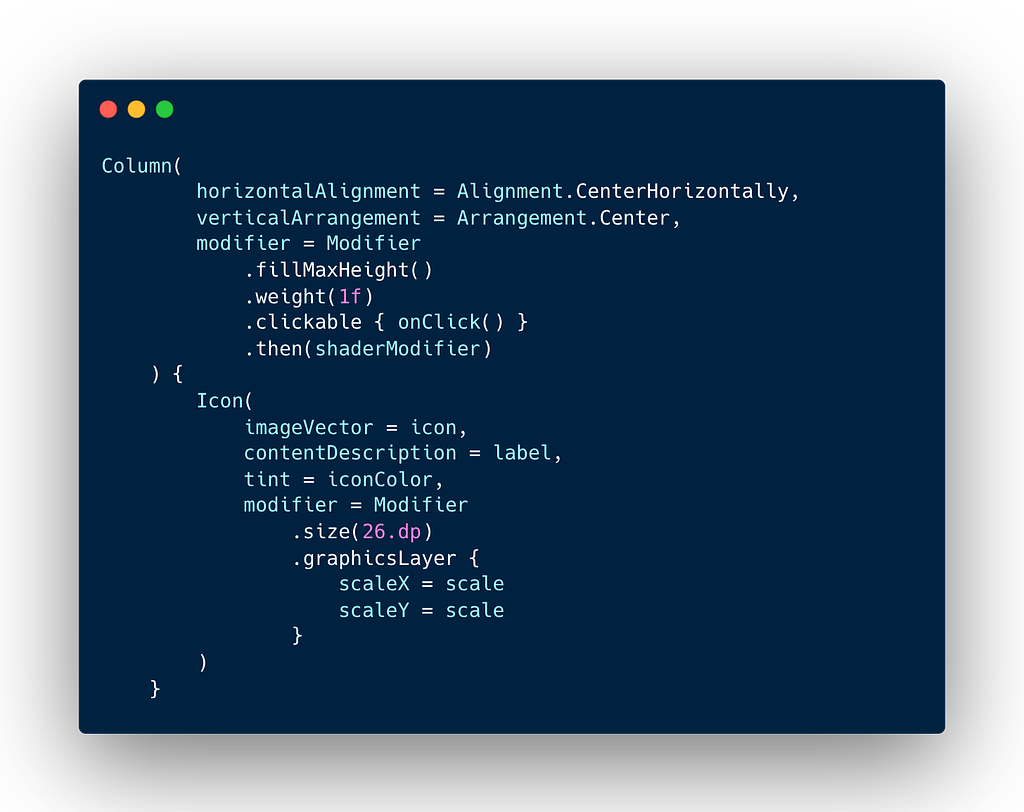
In this final step, we will apply the shaderModifier to the Column container. The Icon uses .graphicsLayer { … } to apply the scale animation efficiently without triggering re-layouts. The result is a column that handles the click events, renders the background glow (on supported devices), and holds the bouncing icon.
Implement Custom Bottom Item Menu
Now that our individual components are ready, let’s assemble the final BottomNavBar. In this step, we combine the glowing menu items with a standard BottomAppBar and integrate a central Floating Action Button. We use a simple negative offset and a border on the FAB to create a floating cradle effect without needing complex path clipping. Here is the complete implementation:
@Composable
fun BottomNavBar(onFabClick: () -> Unit) {
    var selectedTab by remember { mutableIntStateOf(0) }

    BottomAppBar(
        modifier = Modifier.clip(RoundedCornerShape(topStart = 30.dp, topEnd = 30.dp)),
        containerColor = MaterialTheme.colorScheme.surface,
        contentColor = TextGray,
        tonalElevation = 8.dp
    ) {
        BottomNavigationItem(
            icon = Icons.Default.CalendarMonth,
            label = "Tasks",
            selected = selectedTab == 0,
            onClick = { selectedTab = 0 }
        )
        Box(
            modifier = Modifier.weight(1f),
            contentAlignment = Alignment.Center
        ) {
            FloatingActionButton(
                onClick = onFabClick,
                containerColor = MaterialTheme.colorScheme.primary,
                contentColor = MaterialTheme.colorScheme.onPrimary,
                shape = CircleShape,
                modifier = Modifier
                    .offset(y = (-10).dp)
                    .size(56.dp)
                    .border(4.dp, MaterialTheme.colorScheme.surface, CircleShape)
            ) {
                Icon(
                    imageVector = Icons.Default.Add,
                    contentDescription = "Add Task",
                    modifier = Modifier.size(24.dp)
                )
            }
        }
        BottomNavigationItem(
            icon = Icons.Default.Search,
            label = "Search",
            selected = selectedTab == 1,
            onClick = { selectedTab = 1 }
        )
    }
}
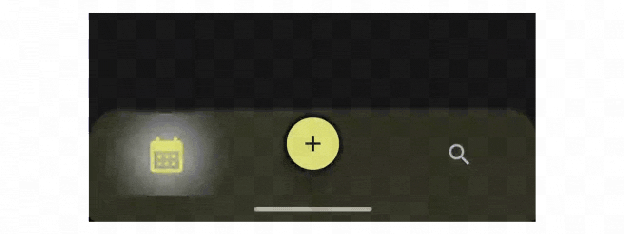
Putting it all together, here is what our fully interactive glowing navigation looks like:
Takeaways
Building custom UI is about more than just placing elements on a screen; it’s about how those elements feel. By using AGSL, we created a visual effect that would be difficult and expensive to render using standard Canvas drawing commands. We achieved a soft, non-linear glow that reacts instantly to user input, all while keeping our Compose code clean and modular. This pattern of Shader + Modifier is a reusable technique you can apply to buttons, cards, or loading states throughout your application.
If you found this article helpful, please consider giving it a clap to show your support! Don’t forget to follow my account for more engaging insights about Android Technology. You can also connect with me on social media through the links Instagram, LinkedIn, X. I’d love to connect, hear your thoughts and see what amazing things you build!
Stay curious, and happy coding ! 😃
Building a Glowing Bottom Navigation with AGSL Shaders was originally published in ProAndroidDev on Medium, where people are continuing the conversation by highlighting and responding to this story.


This Post Has 0 Comments