
When Your Compose Layout Needs to “Peek” at Its Children First
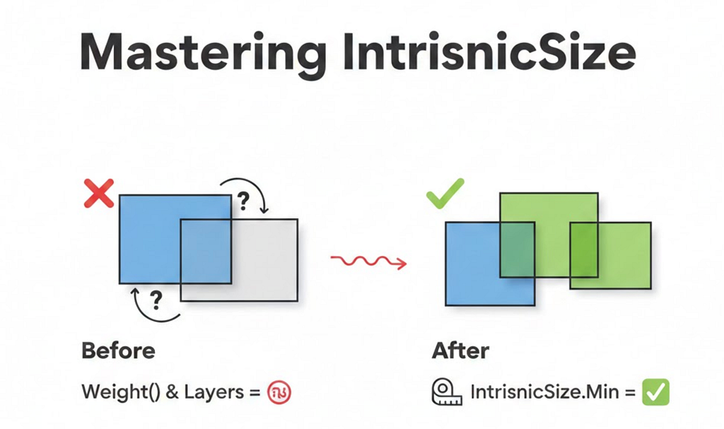
If you’ve been working with Jetpack Compose, you’ve probably hit that frustrating moment where your layout just doesn’t behave the way you expect. Maybe a weight() modifier inside a Box causes weird behavior, or your layered UI elements don’t size correctly.
That’s where IntrinsicSize comes in — and trust me, once you understand it, it becomes one of the most powerful tools in your Compose toolkit.
The Problem: A Real Production Scenario
Recently, I was building a details screen for an app. The design required:
- A header image at the top
- A card that overlaps the header by 56dp
- A smooth background transition from the header to a soft gray background
Here’s what we wanted to achieve:
💡 Design Goal: Create a card that elegantly overlaps a header image, with a seamless background transition.

The Challenge
I needed to create a Box with two layers:
- Layer 1 (Background): 56dp transparent space at top, then soft gray background
- Layer 2 (Card): The actual content card drawn on top
Here’s my first attempt:
@Composable
fun OverlappingCardContent(overlapHeight: Dp) {
    Box(modifier = Modifier.fillMaxWidth()) {
        // Layer 1: Background
        Column(modifier = Modifier.fillMaxWidth()) {
            Spacer(modifier = Modifier.height(overlapHeight)) // 56dp transparent
            Box(
                modifier = Modifier
                    .fillMaxWidth()
                    .weight(1f)  // Fill remaining space with soft background
                    .background(color = Color.LightGray)
            )
        }

        // Layer 2: Card
        Card(modifier = Modifier.fillMaxWidth()) {
            // Card content...
        }
    }
}
But this didn’t work! 😩
The weight(1f) modifier was causing issues. The layout either collapsed or expanded unexpectedly.
Understanding the Root Cause
To understand why this failed, let’s revisit how Compose layout works.
Compose Layout: The Single-Pass System
Compose measures layouts in a single pass for performance. Each composable:
- Receives constraints from its parent
- Measures its children
- Decides its own size
- Places its children
The problem? When a parent like Box measures its children, each child doesn’t know what the other children’s sizes are. They’re measured independently.
Why weight(1f) Failed
The weight() modifier says: “Take up X proportion of the remaining space.”
But remaining space of what? The Box hasn’t decided its height yet — it’s waiting for its children to tell it how big they need to be. This creates a circular dependency:
Box: "Children, how tall are you?"
  ├─ Column: "I need 56dp + whatever weight(1f) gives me"
  │          "But weight depends on your height, Box!"
  └─ Card: "I need ~180dp for my content"

Box: "I'm confused..." 🤯
Enter IntrinsicSize: Breaking the Circular Dependency
IntrinsicSize is Compose’s way of asking children a hypothetical question before the actual measurement:
“If I gave you infinite space, what’s the minimum (or maximum) height you’d need?”
IntrinsicSize.Min vs IntrinsicSize.Max

The Fix
Box(
    modifier = Modifier
        .fillMaxWidth()
        .height(IntrinsicSize.Min)  // ← The magic line!
) {
    // Layer 1: Background
    Column(modifier = Modifier.fillMaxWidth()) {
        Spacer(modifier = Modifier.height(56.dp))
        Box(
            modifier = Modifier
                .fillMaxWidth()
                .weight(1f)
                .background(color = Color.LightGray)
        )
    }

    // Layer 2: Card
    Card(modifier = Modifier.fillMaxWidth()) {
        // Card content...
    }
}
Now the layout works! Here’s why:
How IntrinsicSize.Min Resolves the Conflict
When the Box uses height(IntrinsicSize.Min), it asks each child:
Column’s minimum intrinsic height:
Spacer: 56dp (fixed)
Weighted Box: 0dp (minimum, can shrink to nothing)
Total: 56dp
Card’s minimum intrinsic height:
Status row + Title + Subtitle + Button + Padding = ~180dp
Total: ~180dp
Box picks: max(56dp, 180dp) = 180dp
Why max()? Because the Box needs to be tall enough for all children to fit!
Now the layout knows exactly how tall to be, and the weight(1f) can work correctly:
- Box height: 180dp
- Spacer: 56dp
- Weighted background Box: 180dp — 56dp = 124dp
The Complete Solution: Overlapping Card UI
Here’s the production-ready code that powers this UI:
private val OVERLAP_HEIGHT = 56.dp
@Composable
fun HeaderWithOverlappingCard(imageHeight: Dp) {
    LazyColumn {
        // Create overlap: position content before header ends
        item {
            Spacer(modifier = Modifier.height(imageHeight - OVERLAP_HEIGHT))
        }

        item {
            OverlappingCardContent(overlapHeight = OVERLAP_HEIGHT)
        }
    }
}
@Composable
fun OverlappingCardContent(overlapHeight: Dp) {
    Box(
        modifier = Modifier
            .fillMaxWidth()
            .height(IntrinsicSize.Min)
    ) {
        // Layer 1: Background transition
        Column(modifier = Modifier.fillMaxWidth()) {
            Spacer(modifier = Modifier.height(overlapHeight)) // Transparent over header
            Box(
                modifier = Modifier
                    .fillMaxWidth()
                    .weight(1f)
                    .background(color = SoftGrayBackground)
            )
        }

        // Layer 2: Card content (drawn on top)
        Card(
            modifier = Modifier
                .fillMaxWidth()
                .padding(horizontal = 8.dp),
            shape = RoundedCornerShape(12.dp)
        ) {
            Column(modifier = Modifier.padding(24.dp)) {
                Text("✓ Success", color = Color.Green)
                Text("₹100 Cashback", style = MaterialTheme.typography.h4)
                Text("Transaction complete")
                Spacer(modifier = Modifier.height(16.dp))
                Button(onClick = {}) { Text("View Details") }
            }
        }
    }
}
Visual Breakdown
imageHeight = 200dp
overlapHeight = 56dp
LazyColumn positions:
├─ Spacer: 144dp (200 - 56)
└─ OverlappingCardContent starts at Y = 144dp
Inside OverlappingCardContent (height = 180dp via IntrinsicSize.Min):
├─ Column Layer:
│   ├─ Spacer: 56dp (transparent, header shows through)
│   └─ Background Box: 124dp (soft gray)
└─ Card Layer: 180dp (drawn from top, overlaps header)
Common Use Cases for IntrinsicSize
1. Equal Height Buttons in a Row
Problem: Buttons with different text lengths end up with different heights.
Solution:
Row(modifier = Modifier.height(IntrinsicSize.Min)) {
    Button(
        modifier = Modifier.weight(1f).fillMaxHeight(),
        onClick = {}
    ) { Text("Short") }

    Button(
        modifier = Modifier.weight(1f).fillMaxHeight(),
        onClick = {}
    ) { Text("This is a muchnlonger buttonnwith more text") }
}
Result: Both buttons match the height of the tallest one.

2. Divider Matching Parent Height
Problem: Divider doesn’t stretch to match multi-line content.
Solution:
Row(modifier = Modifier.height(IntrinsicSize.Min)) {
    Text("Left contentnwith multiplenlines")

    Divider(
        modifier = Modifier
            .fillMaxHeight()
            .width(1.dp)
    )

    Text("Right")
}
Result: The divider stretches to match the multi-line text height.

3. Card with Dynamic Content and Fixed Overlay
Problem: Overlay needs to match card width, but card width is dynamic.
Solution:
Box(modifier = Modifier.width(IntrinsicSize.Max)) {
    Card {
        Column {
            Text("Dynamic content here...")
            // More content
        }
    }

    // Badge that should match card width
    Badge(
        modifier = Modifier
            .align(Alignment.TopEnd)
            .fillMaxWidth()
    )
}
Performance Considerations ⚠️
IntrinsicSize triggers a two-pass measurement:
- First pass: Query intrinsic sizes
- Second pass: Actual measurement and layout
This has a performance cost. Use it judiciously:
✅ Good Use Cases
- Complex layered UIs (like our overlapping card)
- Equalizing sibling sizes
- Matching dividers/separators to content
- When you need children to coordinate their sizes
❌ Avoid When
- Inside LazyColumn/LazyRow items that repeat hundreds of times
- Deeply nested intrinsic measurements
- When a fixed size or wrapContentHeight() works
- In performance-critical paths
Key Takeaways
- IntrinsicSize.Min = “Use the minimum height needed by children”
- IntrinsicSize.Max = “Use the maximum height children could want”
- It resolves circular dependencies between parent and child sizing
- Essential for layered UIs where children use weight() or fillMaxHeight()
- Comes with a performance cost — use wisely
Conclusion
IntrinsicSize might seem like a niche API, but it’s essential for building sophisticated UIs in Compose. The overlapping card pattern we built is just one example — you’ll find it invaluable whenever you need siblings to coordinate their sizes or when layered layouts need to “agree” on dimensions.
Next time your Compose layout behaves unexpectedly with weight() or fillMaxHeight(), remember: IntrinsicSize might be the answer.
Have questions or found other creative uses for IntrinsicSize? Drop a comment below!
Follow me for more Android development insights.
Mastering IntrinsicSize in Jetpack Compose: A Real-World Guide was originally published in ProAndroidDev on Medium, where people are continuing the conversation by highlighting and responding to this story.


This Post Has 0 Comments