
In 2022, the Android team introduced the photo picker as a more privacy-centric way for users to share media with apps. As the official documentation notes:
The photo picker provides a browsable interface that presents the user with their media library, sorted by date from newest to oldest. As shown in the privacy best practices codelab, the photo picker provides a safe, built-in way for users to grant your app access to only selected images and videos, instead of their entire media library.
While the original photo picker was a significant step forward, it existed as a separate system activity that took users away from the host app’s context.
In this article, we will talk about the new Embedded Photo Picker.
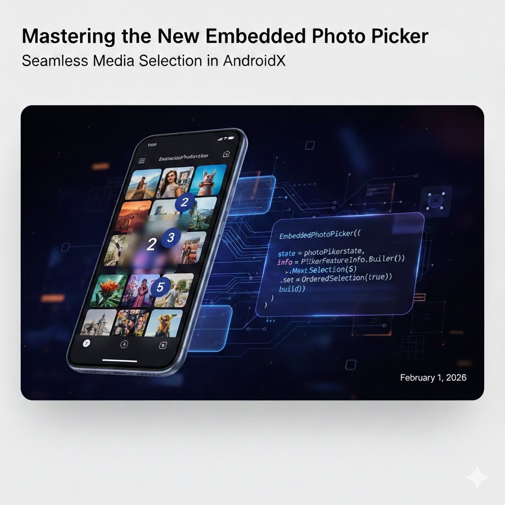
The embedded photo picker is a different form of photo picking experience, allowing it to be interacted directly within an app’s user interface. It offers enhanced integration and customization options compared to the classic photo picker, enabling developers to create a more seamless and cohesive user journey while maintaining the high security standards Android users expect.
Recapping the “Detached” Photo Picker
Before we dive into the embedded version, let’s look at how we typically implemented the “detached” photo picker. I’ve covered the fundamentals of this implementation in my previous article, but a simplified implementation using Jetpack Compose looks like this:
@Composable
fun DetachedPhotoPicker(modifier: Modifier = Modifier) {
    var attachments by remember { mutableStateOf<List<Uri>>(emptyList()) }
    val photoPickerLauncher = rememberLauncherForActivityResult(
        contract = ActivityResultContracts.PickMultipleVisualMedia(5),
        onResult = { uris -> attachments = uris }
    )
    Column(modifier.fillMaxSize().padding(horizontal = 16.dp)) {
        Button(onClick = {
            photoPickerLauncher.launch(
                PickVisualMediaRequest(ActivityResultContracts.PickVisualMedia.ImageOnly)
            )
        }) {
            Text("Open photo picker")
        }

        LazyVerticalGrid(
            columns = GridCells.Adaptive(minSize = 64.dp),
            modifier = Modifier.fillMaxWidth()
        ) {
            itemsIndexed(attachments) { index, uri ->
                AsyncImage(
                    model = uri,
                    contentDescription = "Image ${index + 1}",
                    contentScale = ContentScale.Crop,
                    modifier = Modifier.border(1.dp, Color.White)
                )
            }
        }
    }
}
In this traditional flow, the user clicks a button, is sent to a system-managed UI to pick their media, and then returns to your app. While effective, it creates a slight “context switch” that the new Embedded Photo Picker aims to eliminate.
If you are looking for more technical details or advanced configurations for this detached version, you can always refer to the official Android documentation.
New Photo Picker API ( No permissions !)
Why Use the Embedded Photo Picker?
The embedded photo picker is built for apps that prioritize a smooth, uninterrupted user experience. Instead of jumping between apps, users can browse and select media directly inside your interface.
A More Natural User Experience
Users get instant access to their recent photos and their entire cloud library (like Google Photos) without leaving your app. By supporting features like favorites, albums, and search, it removes the friction of wondering if a photo is stored on the device or in the cloud. It makes the media selection feel like a native part of your app’s design.
Real-Time Interaction and Continuous Selection
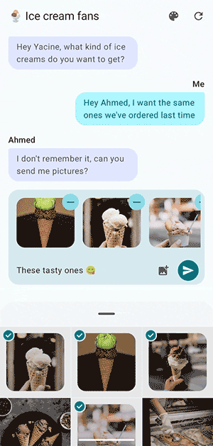
The embedded nature of this picker is particularly useful when you want users to see the immediate effects of their actions. In a chat application, for instance, users expect to see a preview of their selected photos in the message box right away.
The embedded photo picker allows users to continuously select and deselect items from the photo library without closing the picker. Crucially, the items selected and deselected in the app’s UI are synchronized with the photo picker, providing a seamless user experience where the picker and the host app work in perfect harmony.
Privacy Without the Friction
The biggest advantage is the balance of privacy and power. Your app doesn’t need to ask for broad storage permissions; it only receives access to the specific files the user chooses. Additionally, while standard permissions usually only cover local files, the embedded picker provides full access to cloud media without any extra security overhead for you to manage.
Prerequisites and Compatibility
To start using the embedded photo picker, you first need to add the following dependency to your build.gradle file:
dependencies {
    implementation("androidx.photopicker:photopicker-compose:1.0.0-alpha01")
}
Device Requirements
It is important to note that the embedded photo picker has specific hardware and software requirements. It is supported on devices that meet the following criteria:
- Running Android 14 (API level 34) or higher.
- Possess SDK Extensions version 15 or higher.
Because of these requirements, you should always check for availability at runtime. If a device doesn’t meet these capabilities, your app should gracefully fall back to the “classic” photo picker or the backported version via Google Play services.
You can perform this check using the SdkExtensions API:
fun isEmbeddedPhotoPickerAvailable(): Boolean {
    return Build.VERSION.SDK_INT >= Build.VERSION_CODES.UPSIDE_DOWN_CAKE &&
           SdkExtensions.getExtensionVersion(Build.VERSION_CODES.UPSIDE_DOWN_CAKE) >= 15
}
Implementation in Jetpack Compose
Once you have verified compatibility, implementing the picker is straightforward. At its simplest, you just need a state object and the EmbeddedPhotoPicker composable.
@RequiresExtension(extension = Build.VERSION_CODES.UPSIDE_DOWN_CAKE, version = 15)[GIF]
@OptIn(ExperimentalPhotoPickerComposeApi::class)
@Composable
fun BasicEmbeddedPicker() {
// Remember the state of the picker
val photoPickerState = rememberEmbeddedPhotoPickerState()
Column {
EmbeddedPhotoPicker(
state = photoPickerState
)
}
}
Personalizing the Picker
One of the strengths of the embedded version is its customizability. You can use the EmbeddedPhotoPickerFeatureInfo builder to tailor the experience to your app’s needs.
@RequiresExtension(extension = Build.VERSION_CODES.UPSIDE_DOWN_CAKE, version = 15)
@OptIn(ExperimentalPhotoPickerComposeApi::class)
@Composable
fun CustomizedEmbeddedPicker() {
    val photoPickerState = rememberEmbeddedPhotoPickerState()
    // Customize the features and appearance using the app's theme
    val primaryColor = MaterialTheme.colorScheme.primary
    val photoPickerInfo = EmbeddedPhotoPickerFeatureInfo.Builder()
        .setMaxSelectionLimit(5)      // Limit selection to 5 items
        .setOrderedSelection(false)   // Selection order disabled
        .setAccentColor(primaryColor.value.toLong()) // Use theme's primary color
        .build()

    EmbeddedPhotoPicker(
        state = photoPickerState,
        embeddedPhotoPickerFeatureInfo = photoPickerInfo
    )
}
Filtering by MIME Types
You can also control what kind of media the user sees by applying MIME type filters. Once applied, the picker will only display files that match your criteria.
val photoPickerInfo = EmbeddedPhotoPickerFeatureInfo.Builder()
    .setMimeTypes(listOf("image/webp")) // Show only webP images
    .build()
Handling Selections in Real-Time
The state object is where you define your callbacks for real-time synchronization:
@RequiresExtension(extension = Build.VERSION_CODES.UPSIDE_DOWN_CAKE, version = 15)
@OptIn(ExperimentalPhotoPickerComposeApi::class)
@Composable
fun RealTimeEmbeddedPicker() {
    val photoPickerState = rememberEmbeddedPhotoPickerState(
        onSelectionComplete = {
            // User clicked the "Done" button inside the picker
        },
        onUriPermissionGranted = { uris ->
            // Add new selections to your app's local state immediately
        },
        onUriPermissionRevoked = { uris ->
            // Remove deselected items from your UI
        }
    )

    EmbeddedPhotoPicker(
        state = photoPickerState
    )
}
Controlling the Display State (Peek vs. Expanded)
The EmbeddedPhotoPickerState provides a property to control whether the picker is in its “peek” state (showing only recent photos) or its “expanded” state (showing the full library, albums, and search).
val photoPickerState = rememberEmbeddedPhotoPickerState()[VISUAL]
// Signal the picker to show the full library view by default
photoPickerState.setCurrentExpanded(true)
While you can place the EmbeddedPhotoPicker anywhere in your UI, it is often most effective when used within a Bottom Sheet. This matches the platform patterns seen in apps like Google Messages.
For wider screens, you can leverage a supporting page layout to show the picker alongside your main content. This is a great way to utilize extra screen real estate on tablets or foldables.
NavigableSupportingPaneScaffold(
    navigator = navigator,
    mainPane = {
        // Your primary content (e.g., Message List)
    },
    supportingPane = {
        // Picker shown directly in the side pane
        EmbeddedPhotoPicker(state = photoPickerState)
    },
)
You can learn more about building adaptive layouts in the official documentation.
Why use a Bottom Sheet?
- Progressive Disclosure: Bottom sheets naturally support the picker’s two-stage model. You can start in a “peek” state for quick selections and allow users to drag up to expand when they need to search their full library or albums.
- Context Preservation: By using a bottom sheet, you prevent a full-screen takeover. This keeps the user’s primary task — such as a conversation or a post creation — visible and active in the background.
- Familiar platform UX: Using a bottom sheet matches reference implementations like Google Messages. It provides a familiar, gesture-driven interaction (drag to expand/collapse) that feels integrated rather than modal.
If your design doesn’t use a bottom sheet and the picker is displayed in a fixed container, it is generally better to set setCurrentExpanded(true) by default. This ensures the user immediately sees all available navigation components, such as albums and search, which might otherwise be hidden in the compact peek view.
Usage in Bottom Sheet
To implement this effectively in a real-world scenario, you can use BottomSheetScaffold. The following code demonstrates how to sync the sheet’s expansion state with the picker and manage selected media.
@RequiresExtension(extension = Build.VERSION_CODES.UPSIDE_DOWN_CAKE, version = 15)
@OptIn(ExperimentalPhotoPickerComposeApi::class, ExperimentalMaterial3Api::class)
@Composable
fun EmbeddedPhotoPickerDemo() {
    var attachments by remember { mutableStateOf(emptyList<Uri>()) }
    val scope = rememberCoroutineScope()
    val scaffoldState = rememberBottomSheetScaffoldState(
        bottomSheetState = rememberStandardBottomSheetState(
            initialValue = SheetValue.Hidden,
            skipHiddenState = false
        )
    )

    val photoPickerState = rememberEmbeddedPhotoPickerState(
        onSelectionComplete = { scope.launch { scaffoldState.bottomSheetState.hide() } },
        onUriPermissionGranted = { attachments += it },
        onUriPermissionRevoked = { attachments -= it }
    )

    // Synchronize the picker's view with the bottom sheet state
    SideEffect {
        val isExpanded = scaffoldState.bottomSheetState.targetValue == SheetValue.Expanded
        photoPickerState.setCurrentExpanded(isExpanded)
    }

    BottomSheetScaffold(
        scaffoldState = scaffoldState,
        sheetPeekHeight = if (scaffoldState.bottomSheetState.isVisible) 400.dp else 0.dp,
        sheetContent = {
            EmbeddedPhotoPicker(
                state = photoPickerState,
                embeddedPhotoPickerFeatureInfo = EmbeddedPhotoPickerFeatureInfo.Builder()
                    .setMaxSelectionLimit(5)
                    .setOrderedSelection(true)
                    .setMimeTypes(listOf("image/*"))
                    .build()
            )
        }
    ) { padding ->
        Column(Modifier.padding(padding).fillMaxSize().padding(16.dp)) {
            Button(onClick = { scope.launch { scaffoldState.bottomSheetState.partialExpand() } }) {
                Text("Open Photo Picker")
            }

            LazyVerticalGrid(columns = GridCells.Adaptive(64.dp)) {
                items(attachments) { uri ->
                    AsyncImage(
                        model = uri,
                        contentDescription = null,
                        modifier = Modifier.clickable { photoPickerState.deselectUri(uri) }
                    )
                }
            }
        }
    }
}
Note: This sample is based on the Android Developers Blog.
A Note on View-Based Systems
While this article has focused on Jetpack Compose, the Embedded Photo Picker is also available for the View-based system. If your app is still using XML layouts and traditional Fragments/Activities, you can achieve a similar integrated experience using the EmbeddedPhotoPickerView.
For the sake of simplicity, we won’t dive into the View-based details here, but you can find comprehensive guides and examples in the official Android documentation and on the Android Developers Blog.
Conclusion
The Embedded Photo Picker represents a significant evolution in how Android handles media selection. By allowing the library to live directly within your application’s UI, it bridges the gap between high-level security and a fluid user experience.
Whether you are building a social media feed, a profile editor, or a messaging platform, consider utilizing the embedded picker whenever your workflow demands dynamic photo selection. It’s particularly powerful in chat screens, where the ability to preview selections instantly and browse the library without losing the conversation context can vastly improve user engagement.
As you integrate this into your apps, remember to check for compatibility and leverage the customization options to make the experience feel truly native to your brand. Happy coding!
Love you all.
Stay tune for upcoming blogs.
Take care.
Mastering the New Embedded Photo Picker in AndroidX was originally published in ProAndroidDev on Medium, where people are continuing the conversation by highlighting and responding to this story.

This Post Has 0 Comments