
Swipe to Pay, or How we rewrote the Payment Slider on Compose
Remember the good old MotionLayout component? It allows you to easily implement complex animations, including gesture-based ones.
At Drinkit, we had a component made with MotionLayout — a quick payment slider in the menu. It appears when the user adds products to the cart.
With this component, you can quickly pay for your order or go to the cart by tapping on it. MotionLayout was perfect for animating it.

Time passed, bugs accumulated, it became more and more difficult to maintain the element, and the slider drastically needed new functionality:
1. The team wanted the slider to be hidden when the user isn’t logged in, or when the selected coffee shop is closed.

2. For a new Gift to a friend feature we needed to replace the slider background — it had to show rainbow-like effect.

Both features were painful to implement with MotionLayout. The tricky part is the scenes: each View has its properties defined there. And if you need to change how a View behaves, you have to edit the scenes — and that’s not always easy. That’s when we decided to rewrite it in Compose.
Hi! I’m Dmitrii Maksimov — Android developer at Dodo Engineering. Today I’ll show you why Compose is so much nicer for building scalable, extensible UI components.
In this article we’ll go through the process of building this component in Compose, look at the code, and see how it behaves in the UI.
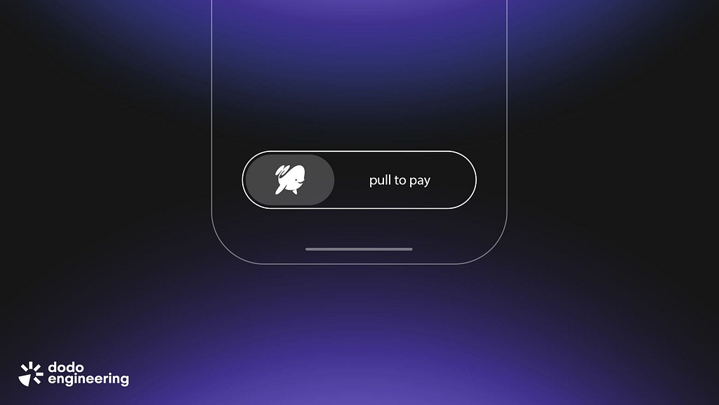
The end result will look like this:

Why we decided to rewrite the component
Quick recap of what we’re starting with:
- the app has a Payment slider feature;
- its UI is implemented with MotionLayout;
- MotionLayout is a cool tool, but it no longer covers what we want — and we’re also tired of the amount of bugs it keeps producing;
- it became easier to rewrite the component than to keep patching and supporting the old version.

First, let’s talk about the bugs we had to fix. Spoiler: all of them were caused by MotionLayout limitations or specifics. The most critical ones:
- MotionLayout has issues with changing views’ visibility. A View’s state is controlled by scenes, so to hide it you basically have to go through all MotionScene scenes and hide it in each one. And it doesn’t always work 😡
- The scenes themselves are XML with lots of tags, which is confusing. Transition, ConstraintSets, Constraint, Layout — many things that make it hard to understand, and you can’t just “read it once and get it”

- Also, recent Android Studio versions removed the MotionLayout Editor, so you have to use other tooling.
All of this resulted in UI bugs that were hard to reproduce and fix. We ended up with weird overlays and broken states, like this:

And sometimes it was even worse: slider on the left and on the right at the same time. You see the price, but “Payment…” is visible through behind it. And you can’t really tell what state you’re in:

At some point it became hopeless. We’d been postponing to rewrite this component to Compose for a long time, but eventually our patience ran out — the current problems became worse than any potential risks. Let’s do it.
What we had, and what we’re building
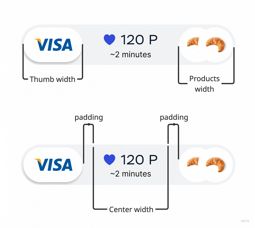
Our payment slider is split into three parts: a draggable slider on the left, the price + ETA in the middle, and the cart contents on the right.

We also have an error state for when payment fails:

Ideally, the slider should work like this:
1. The user presses and holds the slider, we hide the price content and show a hint: “pull to pay”.
2. The user drags the slider stretching it. We hide the hint.
3. The user drags it all the way to the end and releases, the slider returns to its normal size. Payment starts, “payment” hint appears and shimmer turns on to show progress.

Let’s see what others did before us
Some time ago Kontur published an article where they build a similar slider, just a bit simpler. They implemented it in two ways: as a Compound (that’s what I call it by analogy with XML) and as a custom Layout composable.

So… why? It looks like Compound is easier, but it’s actually not true. Doing it via Layout is not only simpler — it’s also better for recomposition optimization. Let’s also try it with our component.
Spoiler: this widget ended up needing a separate sample app to test all states.

Implementation
The Compound Composable approach
For learning purposes we also tried building the slider as a Compound Composable. I did it via a composition of containers — but the hierarchy and the size/position dependencies grew so much that extending it without pain became basically impossible.

And each of those Content blocks has custom layouting using Modifier.layout {}:

We use standard containers, so for a complex component we ended up with custom Modifier.layout {} sprinkled all over the place. So why not build it with a custom Layout right away?
What’s worth remembering?
1. If you’re writing a Composable with a lot of size/position constraints, use Layout from the start.
2. Prefer a flat Layout if the component would otherwise be deeply nested — fewer groups in the Slot Table.
3. Big hierarchies are harder to debug and optimize.
Building the slider with Layout
Now for the fun part. Let’s look at how the slider is built with Layout.
Design and behavior requirements
Like any UI element, this slider has lots of constraints and requirements. It’s better to take it into consideration right from the beginning. The minimum requirements:
1. The slider width must be dynamic. It depends on how much space the products and price content takes, and it’s limited by screen width and padding.
2. The slider is dragged via a gesture with a success threshold: if the user reaches 80% of the component, it should auto-complete to the end; otherwise it returns to the idle state.
3. Slider states Idle, Paying, Syncing, Error can come from outside, independently of the gesture. In that case we need to switch the slider to that state.
4. The slider needs to show:
- thumb — the current payment method. It may be hidden if the coffee shop is closed or the user is a guest;
- center content: price, loyalty badge, ETA. It should fit fully if possible;
- products in cart — from 1 to 3, in order of adding; visually it’s a stacked overlay;
- states: Idle, Error, Paying, Syncing.
At each step I’ll repeat the relevant items and add explanations. And sometimes I’ll extend the list if needed — otherwise this section could become huge.
Sketching the skeleton
The first thing we see in the component is the Thumb and the slider background. Let’s draw those. Since we’re implementing it via Layout, we’ll start with the foundation. Let’s create the component Composable.
Slot API fits this kind of custom component really well (Compose uses it everywhere). Let’s do something similar.
https://medium.com/media/28f9c8327e9f2da7ff1eb65839991faa/href
Inside FastPaymentButton we add a standard Layout. In the content block we draw two composables: background and Thumb
https://medium.com/media/b86a26afc6a0b015f6419f498982075d/href
In our case Thumb and Background are just a Box and an Image. Yours may differ.
Everything we pass into Layout ends up in MeasurePolicy as a List<Measurable>, which we need to measure and place.
Here’s what the measurer implementation looks like:
https://medium.com/media/5cb89591b4d480143a2eed46d9d88069/href
Here we only measure incoming Measurables and getting Placeables. Then we place those Placeables in the parent container.
Before measure and layout there’s a looseConstraints block. The constraints come from the parent. If the parent has an explicit width, children will be measured with that same width, not based on their own content.
For example, Thumb has Modifier.width(96.dp).height(60.dp), and the parent has Modifier.width(400.dp). If we remove looseConstraints, we’ll get this:

To let a view measure itself, we zero out the incoming constraints. From now on we’ll use looseConstraints everywhere:

Looks nice, but not functional yet. To bring it to life, we need the swipe gesture.
Making the slider draggable
Let’s teach Thumb to react to a slide gesture. A great fit is the standard Modifier.anchoredDraggable()
If your Compose version is below 1.6.0-alpha01, use Modifier.swipeable() instead. If you’re planning to upgrade, check the migration guide.
Add the modifier to Thumb:
https://medium.com/media/fadf7347a70201ba8f67e59594dc21dd/href
With startDragImmediately = true you can start dragging right away on touch. Without it, the gesture starts after the finger travels some distance.
We declared anchoredDraggableState earlier. It defines anchors (start/end positions), thresholds, and animations:
https://medium.com/media/ee5f2f6f363720f9c1a72d90d00e63aa/href
The swipe can’t stop in the middle — it only has two states: start and end. So we need two anchors:
https://medium.com/media/c236acaad6ed715eb2962eb8b77b045f/href
To set the end anchor, we need to know the end distance in pixels: instead of End at Float.MAX_VALUE we want fullWidth — thumbWidth.
https://medium.com/media/9500ce82a6668ef799ac1c00cd38f3d6/href
For this in Compose we usually use Modifier.onSizeChanged {}. Apply it to Layout and to Thumb to get their sizes.
https://medium.com/media/5987285100f76366866727f0129af5d9/href
Also, remember the 80% behavior: if the user reaches 80%, the remaining 20% should auto-complete; otherwise we return to idle.
AnchoredDraggableState has a positionalThreshold parameter. The docs say:
The positional threshold, in px, to be used when calculating the target state while a drag is in progress and when settling after the drag ends. This is the distance from the start of a transition.
Based on that I expected it to work out of the box, but nope. When I initialize AnchoredDraggableState with positionalThreshold with 0.8f, snapping happens always at 0.5f:
https://medium.com/media/efe4a38e65acd1053975750332e63062/href
Unfortunately, since compose version 1.7.0, the positionalThreshold parameter is broken and snapping always triggers at position 0.5f. There is even an issue about this.
So we’ll solve it by calculating progress ourselves when the user finishes the gesture. When the finger is released, we check how far the slider traveled from start using anchoredDraggableState.progress(). If it’s more than 80%, we animate it to the end and start payment:
https://medium.com/media/f9479cd846b5d03f35c0e11aedd51829/href
Now, when we drag, AnchoredDraggable updates its offset, but nothing moves yet. To actually move Thumb, we need to apply that offset during the layout phase:
https://medium.com/media/1b805ad3174f13d9a96185588f4274ed/href
Now Thumb follows the finger. It snaps to start or end, switching sides when it passes 80%:

Reacting to a dragged slider
The gesture is ready — let’s wire up callbacks. Payment should start when the user swipes beyond 80% of the component width and releases.
Thanks to the LaunchedEffect above, we already know the moment the user ends the gesture and which direction we should animate:
https://medium.com/media/f7ac75d312fc24acb57a722937e928f5/href
In detail: we observe the current gesture via InteractionSource. First, define it:
https://medium.com/media/2de2ec481b9a43f9f6a8539d64d28758/href
Then pass it into anchoredDraggable:
https://medium.com/media/807c8a0e7c09bdce1db7dd6f1e496fb7/href
AnchoredDraggable reports gestures itself — we just read them. Inside, we watch interactionSource.collectIsDraggedAsState() and use it as a key for LaunchedEffect.
Now we add the onSwiped callback: this is where we start payment and switch the slider state:
https://medium.com/media/0d47f3503ad45f749d50b2770552f901/href
Voilà! Payment starts at the end of the gesture when we reach 80% width — just like we planned:

(Not) building the rest of the views
Now let’s fill the slider with useful content about products and price and indicators — basically everything a user needs to place an order:

Exactly how you draw this UI isn’t that important — it can differ depending on your product. I won’t spend too much time on visuals; I’ll just show what our slider consists of:

Measurement rules:
1. Thumb width is constant. If Thumb is hidden, we ignore it in measurements.
2. Product stack is always there. For a given number of products, its width is constant.
3. Center content (price, ETA, etc). It should be as small as possible to avoid artifacts, but it can’t exceed the slider’s max width.
Put content into Layout via content:
https://medium.com/media/5f50ea3f84b10ac8bc9eb6038feb3a6f/href
Find Thumb in measure block and measure it:
https://medium.com/media/2078ca79980a5b95041e19e44a6c3c11/href
Now measure the center. By design, slider width should be dynamic. At the same time, it should not get too wide and must fit on screen.
First we find the minimum required width for the center content. We place it between Thumb and End with small paddings on both sides:
Then we measure the center Measurable, limiting its max width:
https://medium.com/media/e6637a7500ffda1b04ac284d018eae38/href
Here centerMaxWidth is computed as:
val centerMaxWidth = maxWidth - thumbWidth - endWidth - start/end paddings
The actual calculation of centerMaxWidth is presented below:
https://medium.com/media/cc514580ccc61d16edc62f270e671936/href
After measuring, we have Placeables that we need to place inside layout {}. We should do it in the order of visibility:
1. Draw the center content (price) first, so Thumb can overlap it when it moves.
2. Then draw the product stack, so Thumb can also overlap it if the swipe animation is very fast.
3. Finally draw Thumb on top of everything.
https://medium.com/media/1ef943ab6b269eaa409055bc2fa5c390/href
Two new variables appeared here:
1. occupiedWidth is the combined width of all elements. Just to be safe, we clamp it:
val occupiedWidth =
  (thumbWidth + endWidth + centerWidth)
      .coerceIn(constraints.minWidth, looseConstraints.maxWidth)
2. centerStartX is the x coordinate to the start position for the center block:
val centerStartX = thumbWidth + someOffset
Why do we need someOffset? To center the block nicely between Thumb and End.
The thing is: we also limit the slider width. The space between Thumb and End might be larger than the Center itself. Either way, we need to put Center into the middle of the available space.
To find the offset, we compute the empty center width, subtract the real CenterContent width, and divide by 2:
https://medium.com/media/b9be6b3dd55bce1fcfd36476c102e3a7/href
All set! Run it and enjoy the result:

Polishing it
Now we just need to polish it: implement more states, add more animations, haptics, and shimmer. Let’s go!
A stretching “trail” behind the slider
We want a white strip to stretch behind Thumb while dragging. It collapses into the final point when payment starts:

For clarity, I’ll draw the strip outside the component bounds. Here’s what we want:

Assume we drew the strip and placed it inside Layout:
https://medium.com/media/1d71860a9a9effbbfdcabfc5a6b26f96/href
First, Now we have to stretch the underlay while we drag Thumb to the end. So we measure its width properly.
In our case the width will be the following
val progressWidth = draggable.offset + thumbWidth
And the full code to measure and layout is here:
https://medium.com/media/683ee9fec76ab3d34663868e7b7a19f5/href
Second, we want the left edge of the underlay to magnet to the left Thumb position when the slider passes 80%.
To do this, we animate a value from 0 to fullWidth-thumbWidth. We start the animation when state changes.
https://medium.com/media/fae3df8b9cfdfbe447c74229b582e073/href
This shift affects the strip width — we just subtract it. We pass the value into MeasurePolicy and subtract:
https://medium.com/media/37a6cec1319b155bc6b5b3a060dc2571/href
Now we get exactly what we wanted:

Animating labels while dragging
While dragging, the Pull to pay and Paying labels are animated. Pull to pay changes alpha as you drag, and Paying slides in from the left when we transition into the paying state.

Measure both components in our Layout:
https://medium.com/media/933486d3d48f55cbb65563e77159700b/href
Both texts have the same width: slider width minus Thumb width. For placement: Pull to pay goes right after Thumb, while Paying needs to move in with animation.
For that I reused progressStartPosition from the previous step. We take it and shift Paying content left outside the slider bounds to get the pop-in effect:
https://medium.com/media/2743815cafaf242b052ddb428d3cc192/href
We also animate alpha for these labels. What’s an efficient way to do it? Create a class that holds the animated states:
https://medium.com/media/a8dab916e619da545d7ac3ecb1b0cb96/href
Initialize animations in a separate Composable function. We pass required states and track slider updates. This lets us move all animation-related code into one place. We also keep frequently changing values in a separate scope:
https://medium.com/media/5fc8a3cdcb8cb547d0c08d232daecbbd/href
I took this approach from Ozon’s excellent series on Compose optimization. Check it out!
Apply these alpha values to components. Example: I apply alpha to Pull To Pay via Modifier.alpha {}:
https://medium.com/media/ccdcef6fb0f0c0f1473a72f806ff45b4/href
Now we get animated labels that react both to the gesture and to state:
Controlling the slider via state
The slider also needs to react to cart/payment state coming from outside: show error, loading indicator, payment progress, etc.
To switch state, we need to animate DraggableState to the correct anchor. We do this via LaunchedEffect with the key with value of fastPaymentState.cartState.
https://medium.com/media/ecc9855f1ece3c6fa809daa6bfdd515a/href
Inside setPaymentState() we only run an animation. In Paying state the slider must be at the end anchor; in all other states we reset it back to start.
https://medium.com/media/9211ed8413f3cb8920ca84f54b511694/href
Shimmer
The payment slider is decorated with shimmer — a moving gradient which indicates that something is happening, like payment processing.

There are many shimmer implementations in Compose. We used the one from Accompanist — the library doesn’t exist anymore, but the idea is the same. Shimmer is initialized via Modifier.placeholder():
https://medium.com/media/cab390f789faea4fb98409ec17f9c1aa/href
The gradient animation is configured via PlaceholderHighLight.shimmer(). We need animationSpec for fine tuning:
https://medium.com/media/70aab43a3dff680f6fa9c3d35cf02629/href
Whether to show the gradient is computed in isShimmerVisible(). We enable shimmer when payment is running:
https://medium.com/media/930a7b0c0099fdb45960f4ba3fbb0781/href
Then we just pass shimmer content into Layout {}, measure it, and place it:
By the way, you can also add shimmer to the static state as an onboarding hint. For the static state we slow the animation down:
https://medium.com/media/785edf1e0950bc99d440880d9eeef78c/href
Update isShimmerVisible() to show shimmer in the static state — when the user is not dragging, and the current state is Idle:
https://medium.com/media/eb9a72b772b3f19798dd140e2242261e/href
The static hint is controlled by idleHintVisible. We just toggle it by interval:
https://medium.com/media/ccbfbb50ab87926c65ce987d335c2062/href
Result: a hint in the initial position that sometimes “reminds you” that the component is interactive:

Haptics
Here we cut corners. Yep, haptics matter as feedback, but on Android we didn’t go too deep. On iOS we did a very pleasant tactile haptic — so good that we even wrote an article about it. Highly recommend.
Still, we didn’t leave Android users with zero feedback. I decided not to bake haptics into the component itself and instead implemented it as a separate side-effect.
https://medium.com/media/5065cdbc5366a7df9e5b983765af28ad/href
The first side-effect toggles vibration on/off via handleVibrationEnabled. We only need tactile feedback when the user is actively dragging the slider.
The second side-effect sends progress into the vibration service. Inside changeProgress, the phone vibrates every 10% of slider drag.
Recompositions and performance
So how does the slider look in terms of recompositions? I ran the app, clicked through different states, dragged the slider:
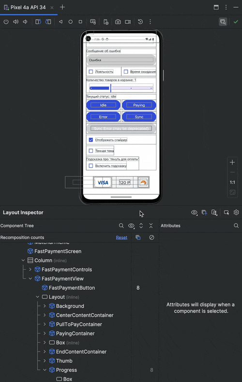
Don’t expect zero recompositions. Trying to eliminate them completely is also pointless — sometimes it’s simply impossible because content changes.
In our case, in the first column of Layout Inspector (or on the device) you can see a new recomposition whenever we trigger show/hide the pull to pay hint and hide/show all slider content.
Why? Because state changes and the animation restarts.
At the same time, in the second column (skipped recompositions) the counters increase. That means the recomposition from the parent scope doesn’t propagate into children. And that’s good for performance.
Shimmer is not as nice — it causes lots of recompositions. But that’s how the modifier works. For now we just live with it.
Links
- Repository with the component source code and a sandbox for experiments.
- The series of articles of how to optimize Compose for better performance. First part and second part
Conclusions
Building a custom component with Layout isn’t that hard. You pass content into it, measure how much space it needs, and place it in the right order.
With Compose and the standard animation tools, we control the whole component and can change it whenever we want. And because the UI is declarative, we also seriously reduce the number of possible bugs.
Worth reminding: the MotionLayout version had more than 15 bugs. Fixing them was almost impossible because debugging was painful and MotionLayout itself has a lot of limitations.
Have you tried rewriting components from MotionLayout to Compose? Or did you start directly with Compose? Share your experience in the comments!
Thank you for reading my article. I hope you liked it. If you have any words to say please drop them in the comments, and I’ll read them!
And follow me on LinkedIn. I post different and interesting things about Android development there.
Swipe to Pay, or How We Rewrote the Payment Slider on Compose was originally published in ProAndroidDev on Medium, where people are continuing the conversation by highlighting and responding to this story.

This Post Has 0 Comments